I Pupi Siciliani Specialities
End-to-end design and build of a Sicilian wine webshop, completed during a six-month internship at naemt.nu, a Danish web agency based in Odense. Working directly with the agency CEO and the Sicilian client, I shaped the brand frame, product architecture and checkout flow into a shop that feels as warm and direct as the wines it sells.
Role
Web Designer & Developer
Agency
Project Type
E-commerce Website
Duration
Feb 2025 – Jul 2025
The Problem
Antonio, the founder of I Pupi Siciliani, imports small-production Sicilian wines into Denmark but had no digital storefront. Customers had to message him directly to order, there was no clear catalogue, no story behind each winery, and no way to handle Danish-market checkout, shipping and VAT in a self-serve way.
The Solution
A focused webshop built inside the technical and brand frame set by naemt.nu: a warm, editorial landing page that introduces Antonio and the wineries, a clean product catalogue with story-driven product pages, and a friction-free checkout tuned for Danish customers — all maintainable by a one-person business.
01 — Stakeholders
Three voices, one product.
The project lived between an agency in Denmark, a client in Sicily and the wineries themselves. Aligning their expectations shaped most of the early decisions.
Agency & site owner
naemt.nu — Sebastian (CEO)
Danish web agency in Odense run by Tore and Sebastian, specialised in transparent, easy-to-use websites with no binding contracts. Sebastian was my direct referent and the owner of the ipupisiciliani.dk site.
Client
I Pupi Siciliani — Antonio
Founder and sole operator. He brought the wineries, the story and the constraints of running a one-person import business in Denmark.
Producers
Sicilian wineries
Small family producers interviewed remotely to gather the stories, photos and tasting notes that power each product page.
02 — Process
Six steps, one coherent shop.
From kick-off in Odense to deploy, working inside the existing naemt.nu theme and review loop.
Kick-off
Aligned with Sebastian on scope, brand frame and the technical boundaries of the existing naemt.nu theme. Defined what could be extended versus what had to be built from scratch.
Research
Interviewed Antonio and the Sicilian wineries remotely, benchmarked Danish wine shops, and mapped the audience: Danish customers who care about provenance and a personal story behind the bottle.
Information architecture
Structured the site around three jobs: discover the brand, browse the catalogue, complete a Danish-market checkout. Defined product taxonomy, page types and a content model Antonio could maintain alone.
Visual design
Translated the warm, hand-crafted Sicilian identity into a digital language that still fits the calm, minimal house style of naemt.nu — editorial typography, generous whitespace, photography as the hero.
Build
Extended the existing naemt.nu theme rather than rebuilding from scratch: new templates for landing, catalogue and product pages, plus the checkout and shipping logic tuned for Denmark.
Review & deploy
Code reviewed and approved by Sebastian, then deployed to ipupisiciliani.dk. Handover included a short manual so Antonio could add new wines and producers on his own.
03 — Voice of the founder
A shop built around Antonio.
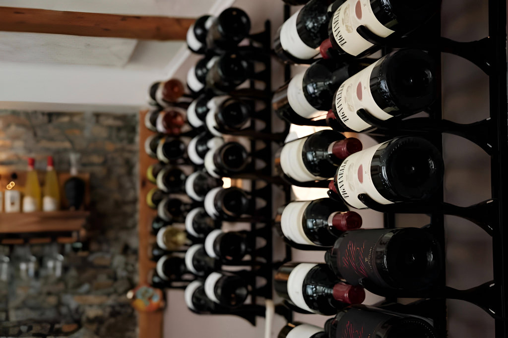
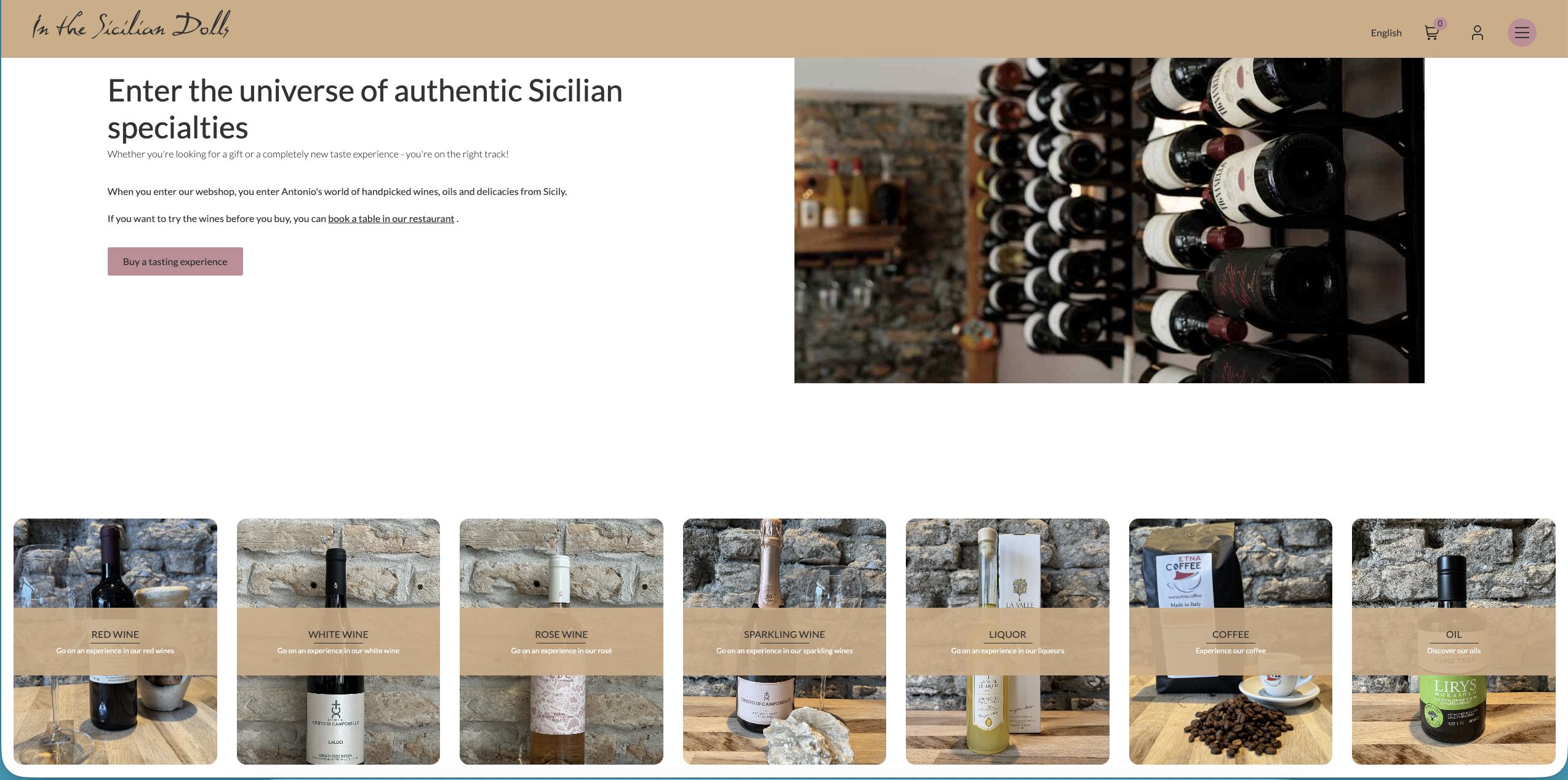
Antonio is the brand. The landing page leads with his face and story so the customer understands, before any bottle is shown, who is choosing these wines and why.

04 — Catalogue & checkout
From bottle to basket, without friction.
The catalogue uses a calm grid with clear price, region and grape, while product pages give each wine the room for a real story. Checkout is short, localised in Danish, and built to be maintained by one person.
05 — Key design decisions
Why it works.
Founder-first landing
Antonio's face and story open the homepage so trust is established before the catalogue is shown.
Editorial product pages
Each wine gets a story, the winery behind it, region, grape and tasting notes — not just a price and a button.
Danish-market checkout
Localised in Danish, with shipping options and VAT logic tuned for a one-person import business.
Inside the naemt.nu frame
Built on top of the existing agency theme so future maintenance stays inside their familiar codebase.
Maintainable by one person
Content model and admin flow designed so Antonio can add wines and producers without developer help.
Warm, restrained palette
Earthy amber accents on a calm off-white surface — Sicilian warmth, Scandinavian discipline.
06 — Information architecture
Structuring the whole shop before drawing a single screen.
Before any visual work, I mapped the entire site as a tree of jobs the customer comes to do. The goal, following Steve Krug's "don't make me think", was that any visitor — Danish wine buyer, curious browser, or returning customer — could reach what they wanted in three clicks or fewer, without ever reading a label twice.
Sitemap
Home (founder-first landing)
├── Shop
│   ├── By region   (Etna · Vittoria · Marsala · …)
│   ├── By grape    (Nero d'Avola · Grillo · Frappato · …)
│   ├── By type     (Red · White · Rosé · Dessert)
│   └── Product page
│        ├── Story of the winery
│        ├── Tasting notes  (grape · region · pairing)
│        ├── Price & add to cart  (primary CTA)
│        └── Related wines        (same winery / grape)
├── Wineries        (producer index, one page each)
├── About Antonio   (founder story, trust layer)
├── Contact         (direct line to Antonio)
└── Cart → Checkout (DK shipping · VAT · payment)
Grouping by meaning, not by SKU
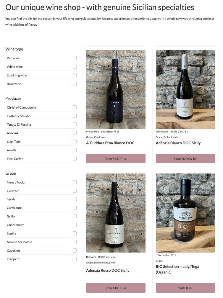
The catalogue is faceted by region, grape and type because that is how customers actually talk about wine — never by internal product codes. Each facet is a mental category they already own.
Three primary jobs only
The global nav exposes only Shop, Wineries, About. Everything else (cart, contact, language) is utility. Krug: fewer top-level choices, faster decisions.
Flat, not deep
No category is more than two clicks from the home page. Depth kills exploration on a small catalogue.
07 — Page-by-page rationale
Why each block sits exactly where it sits.
Every page has a single primary job. Blocks are ordered top-to-bottom by how directly they serve that job, and grouped by the Gestalt principle of proximity so the eye reads them as one thought.
Home
Job: build trust, then send to Shop. Order: founder portrait → one-line promise → featured wines → wineries → newsletter.
Antonio's face is first because liking (Cialdini) is the cheapest trust signal we had — people buy from a person, not a logo. Featured wines come before the full catalogue to lower the activation cost of the first click.
Shop / catalogue
Job: let the customer narrow 40+ wines to 3 candidates. Filters (region, grape, type) sit left on desktop, top on mobile, in that fixed order — most-used facet first.
Cards show only price, region and grape: Hick's law — fewer attributes, faster scanning. The grid uses a single column-width so cards align in a clear Z-pattern.
Product page
Job: convert one wine into one add-to-cart. Order: bottle photo → name + region + grape → price + CTA → story of the winery → tasting notes → related wines.
Price and CTA are above the fold because commitment (Cialdini) starts the moment the visitor reserves intent. The story sits below because it converts the hesitant — those who scroll are the ones who need authority and social proof.
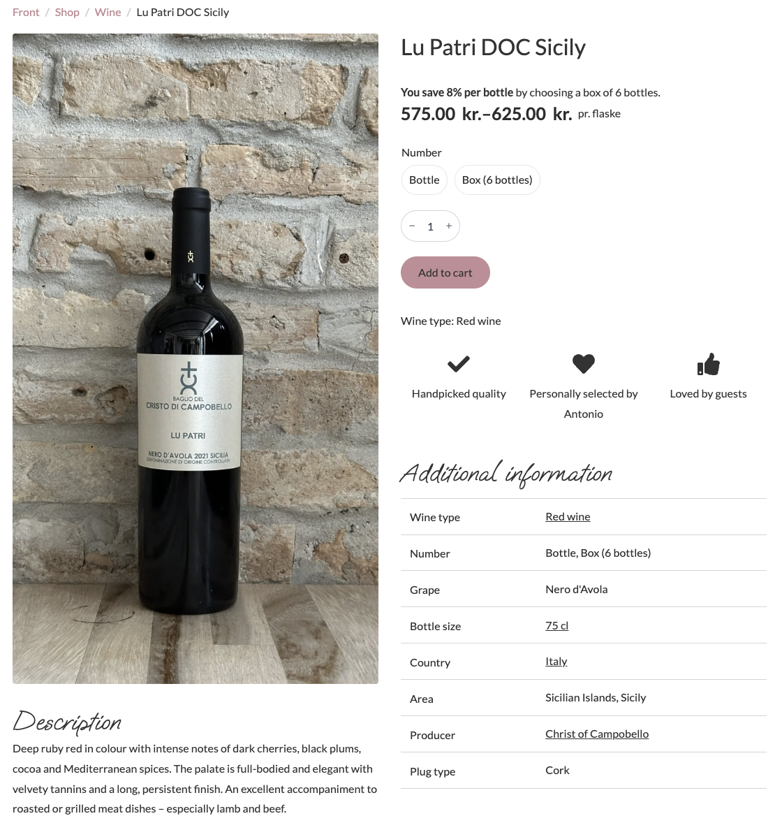
Left half — the bottle does the work
Half the viewport is the photo against a Sicilian stone wall. In wine, the label is the brand: no carousel, no thumbnails, no zoom widget. One image removes the "which one do I click?" tax (Hick's law) and gives the bottle the same gravity it has on the restaurant table.
Right half — the decision stack
Breadcrumb → name → savings line → price → quantity → amber CTA. Six elements stacked in the exact order the buyer asks them in their head: where am I → what is it → is it a deal → how much → how many → buy. Nothing competes with the CTA above it.
Trust row under the CTA
Three icons — handpicked quality, personally selected by Antonio, loved by guests — sit immediately after Add to cart. That's Cialdini stacked three ways in one row: authority (curation), liking (Antonio's name, not a faceless shop), social proof (guests). Placed after the CTA so they nudge the hesitant without delaying the decisive.
Box vs bottle — anchoring, not upsell
"You save 8% per bottle by choosing a box of 6" runs above the price, and the two pills (Bottle / Box) sit right under it. Classic anchoring: the box reframes the bottle price as the expensive option without ever pushing. The customer feels they discovered the deal, not that they were sold one.
Description below the fold
Tasting notes are written like Antonio talks — ruby red, dark cherries, lamb and beef. They sit under the bottle photo, not next to the price, because they convert scrollers: the people still deciding. Decisive buyers never need them.
Additional information as a quiet table
Grape, bottle size, country, area, producer, plug type — demoted into a clean table. They confirm a decision, they don't drive it (Krug: "don't make me think"). Producer and area are linked because curious buyers will go deeper; everyone else can skip the block entirely.
Wineries
Job: give each producer a face. One card per winery, linking to their wines.
Pure authority page: small producers, real names, real places. It is the page Antonio sends to skeptics.
Cart & checkout
Job: finish the order with zero second-guessing. One column, three visible steps, Danish from the first field.
Shipping and VAT are shown before payment — Krug's "no surprises" rule. The cart never hides under a modal; it has its own URL so customers can come back.
08 — Persuasion & usability principles
The theory behind the choices.
Every layout decision maps back to something I studied during my design degree — Cialdini's principles of influence and Steve Krug's usability heuristics. Calling them out keeps the design defensible, not decorative.
Reciprocity
Free shipping over a threshold and an honest origin story given upfront — the shop offers value before asking for the sale.
Commitment & consistency
Micro-commitments along the funnel: choose region → choose grape → add to cart → checkout. Each step is small and the user keeps moving in the same direction.
Social proof
Tasting notes, winery testimonials and producer photos signal that real people stand behind each bottle.
Authority
Region, grape, vintage and producer are surfaced like an editorial wine guide — the shop talks like someone who knows wine.
Liking
Antonio's face on the home page, warm photography, first-person copy. Customers buy from a person they feel they know.
Scarcity
Small-production wines, limited bottles per vintage — communicated honestly, never as fake urgency.
Krug · Don't make me think
Self-evident labels, conventional placements (logo top-left, cart top-right), nothing clever where clarity wins.
Krug · Scannability
Clear visual hierarchy, short paragraphs, meaningful headings — pages are designed to be scanned, not read.
Gestalt · Proximity & similarity
Related elements live close together and share styling; unrelated ones are separated by whitespace, not dividers. Grouping does the work that lines would do in a weaker design.
09 — Typography & color
A voice of its own, connected to naemt.nu.
The shop needed to feel distinctly Sicilian without breaking from the calm, Scandinavian house style of naemt.nu. The system uses different families and a different accent — but the same restraint, spacing scale and tone of voice as the parent agency site.
Typography
Display — Editorial serif feel
Used for headlines, wine names, winery names. Picked for warmth and a hand-set, old-world print character that echoes wine labels.
Body — A humanist sans for readability. Long tasting notes and producer stories sit comfortably at 16 / 28 px, with generous measure (~65 characters per line) to keep reading effortless.
Mono — section labels, metadata, prices
Color system
Amber
#c27803
Primary accent
Ink
#0f0f10
Text
Muted
#5b5b60
Body
Surface
#faf7f2
Backgrounds
Border
#e7e2d8
Dividers
Paper
#ffffff
Canvas
Bordeaux
#7a1f2b
Red wines
Straw
#d8c170
White wines
Earthy amber replaces naemt.nu's cooler accent — Sicilian sun against the same off-white canvas. Two category tints (Bordeaux for reds, Straw for whites) are used sparingly to help scanning the catalogue, never as decoration.
10 — Learnings
What this project taught me.
Working inside an existing agency frame was the biggest lesson: respecting naemt.nu's theme and conventions sped up delivery and made handover painless, even though it meant trading some design freedom early on.
Building for a one-person business also reshaped my priorities. Every screen had to be either obvious to the end customer or trivial for Antonio to update — anything that needed a developer was a design failure.
View live site