
Ungdomskort: Transit Redesign
National Danish Student Travel Pass Overhaul. Website and mobile app redesign for Denmark’s national student transit service, solving payment complexity, mobile responsiveness, and enforcing strict WCAG 2.2 AA compliance.
Role
Lead Product Designer & Accessibility Engineer
Project Type
Responsive Web & Mobile Service
Tools Used
Figma, HTML5, WCAG 2.2 Audit, Miro
Duration
4 Months
100%
Full AA compliance verified with axe-core & manual screen reader audits.
-45%
Reduction in user step completion times during pass renewal.
+92%
Positive feedback rating from 18-25 year old Danish student cohort.
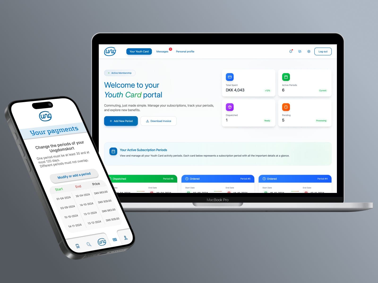
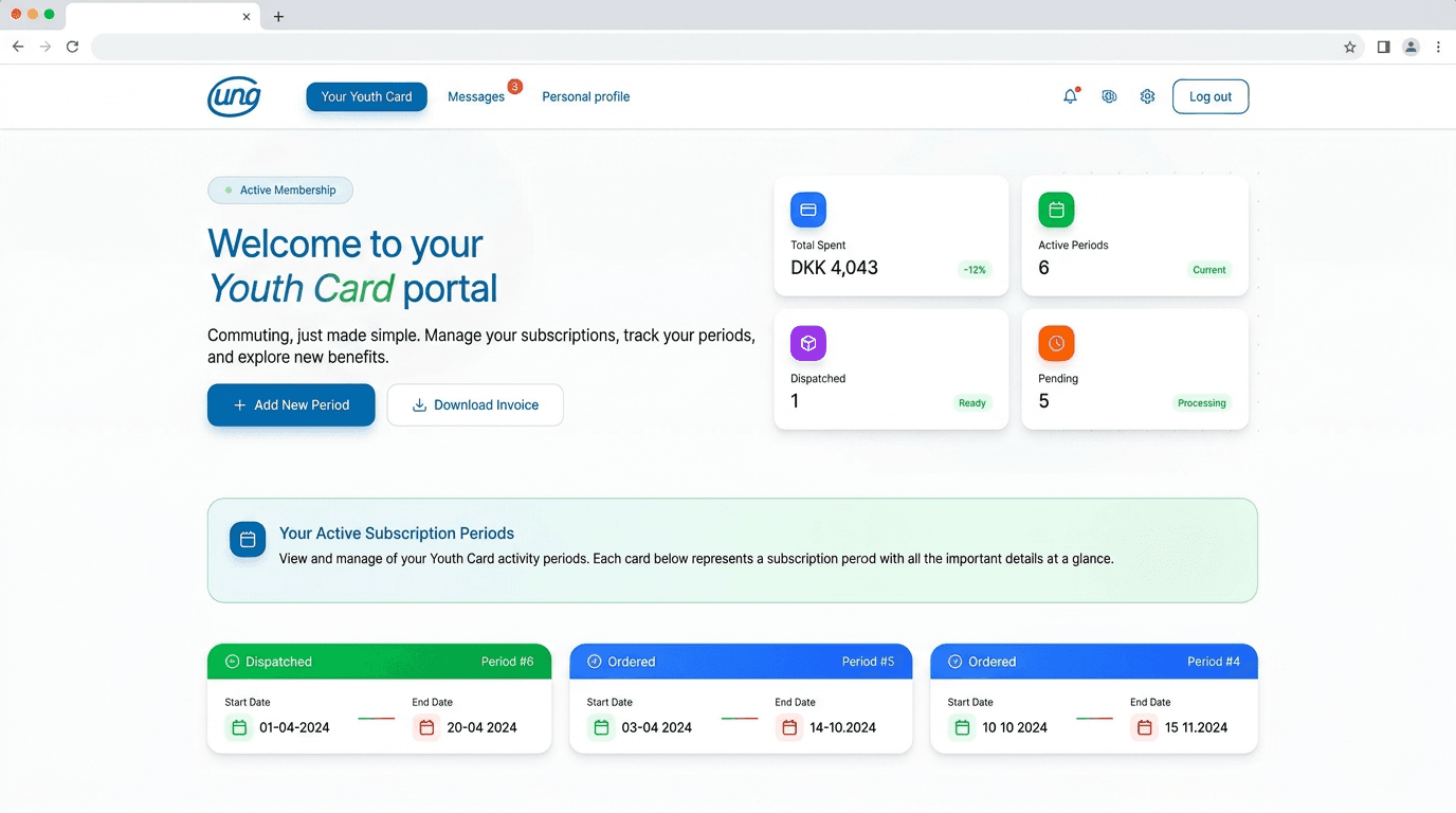
Ungdomskort Redesigned Web Portal
Explore the live, working student transport dashboard, calendar, message center, and student profile below.
Welcome to your
Youth Card portal
Commuting, just made simple. Manage your subscriptions, track your active periods, and explore new benefits.
DKK 4,043
-12% savings6
Current1
Ready5
ProcessingYour Active Subscription Periods
Each card below represents a subscription period with key validity dates.
User Friction & Bottlenecks
Danish students faced extreme cognitive friction and transaction drop-off when applying for and renewing their national transport pass. The existing platform suffered from broken mobile layouts, ambiguous payment step guidance, and severe non-compliance with European accessibility standards (WCAG 2.1/2.2).
Strategic Product Architecture
A complete mobile-first redesign of Ungdomskort.dk and companion app flow. Re-architected the multi-step verification and payment funnel into an intuitive 3-step wizard, introduced automated calendar renewal alerts, and established a WCAG 2.2 AA compliant tokenized color and typography system.
Structured Methodology
Heuristic Evaluation & Audit
Audited existing Ungdomskort portal against Nielsen Norman Group heuristics and WCAG 2.2 standards. Identified 14 critical usability blockers including broken contrast ratios and hidden tab focus indicators.
Empirical User Research
Conducted contextual inquiries and user interviews with Danish university students. Discovered that 78% attempted pass renewals on smartphones while commuting.
IA & Flow Simplification
Rebuilt the 7-stage approval funnel (MitID identity verification, zone selection, payment, delivery) into a clear 3-stage visual progress tracker.
Accessible Design Tokens
Crafted high-contrast UI component tokens in Figma matching official Danish transport branding while exceeding strict contrast guidelines.
Prototyping & Screen Reader Verification
Built fully interactive responsive prototypes and tested keyboard focus traps, voiceover announcements, and dynamic text resizing.
Research Documentation & Artifacts
Competitive Analysis
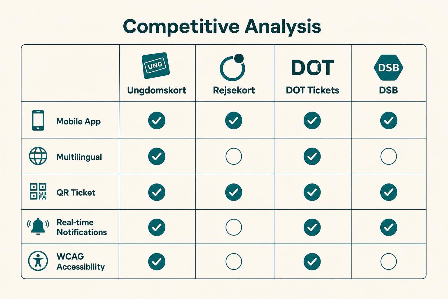
Evaluated Danish regional transport portals (Rejsekort, DSB, DOT) to benchmark accessibility, zone selectors, and checkout flows.
User Personas
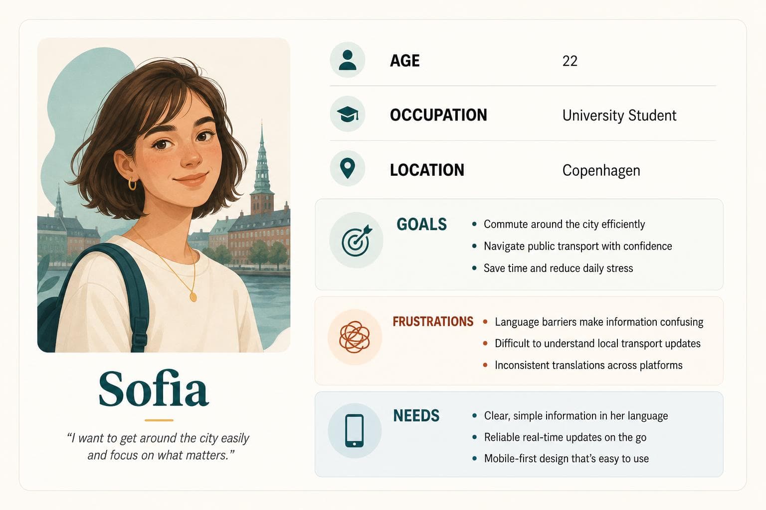
Persona 1: Commuting University Student
Needs instant mobile pass renewal while on the train.
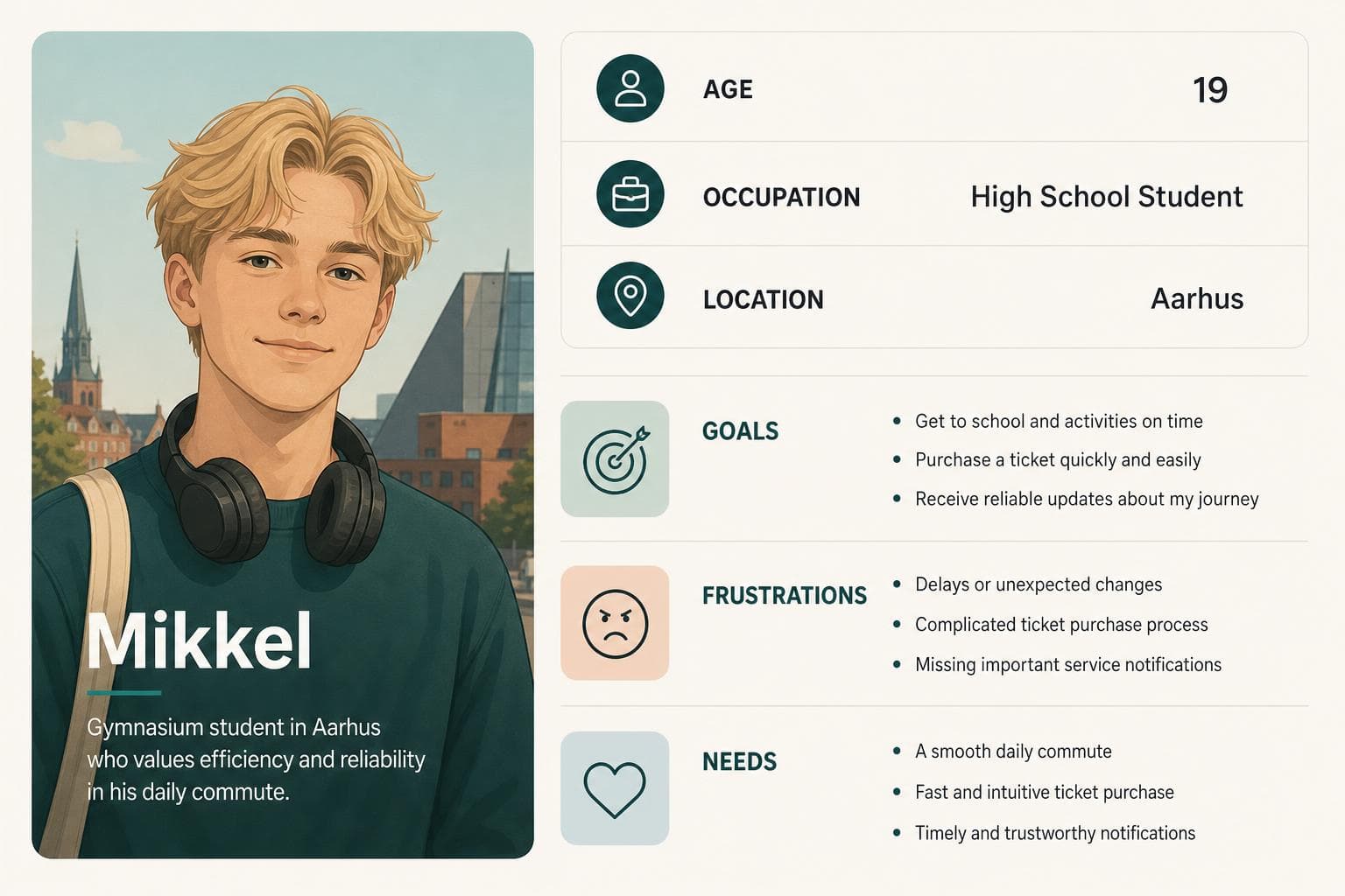
Persona 2: High School Student (First-Time User)
Needs clear step guidance for MitID verification and zone boundaries.
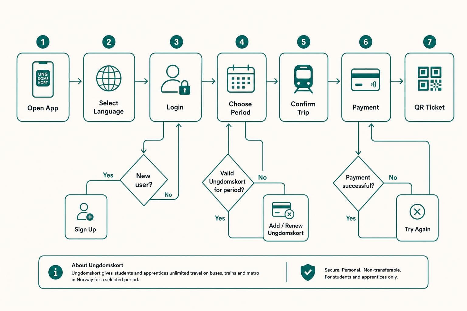
Danish Transport Flow Architecture
Before vs After Layout Transformations
Comparing the legacy non-responsive website with the redesigned accessible platform.
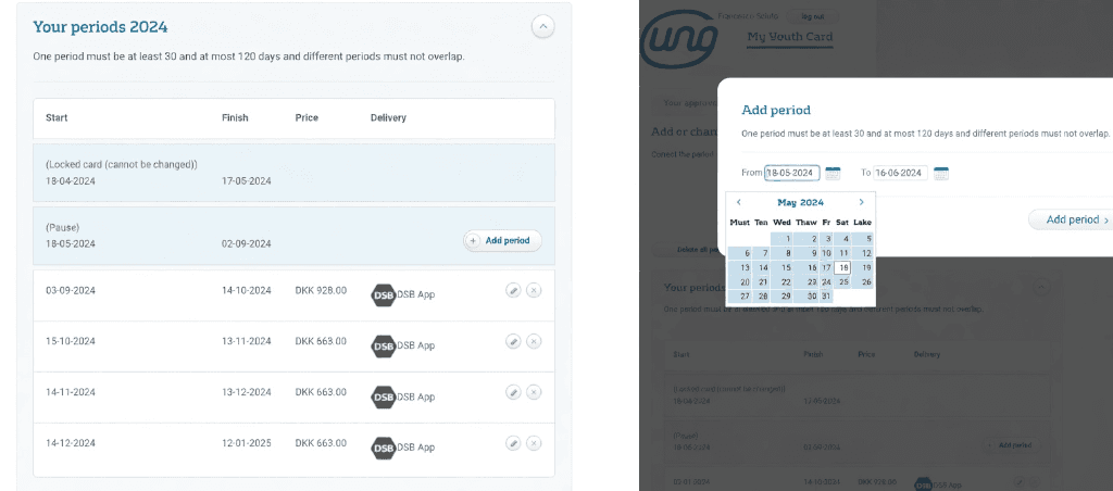
Legacy Step 1 (Cluttered)
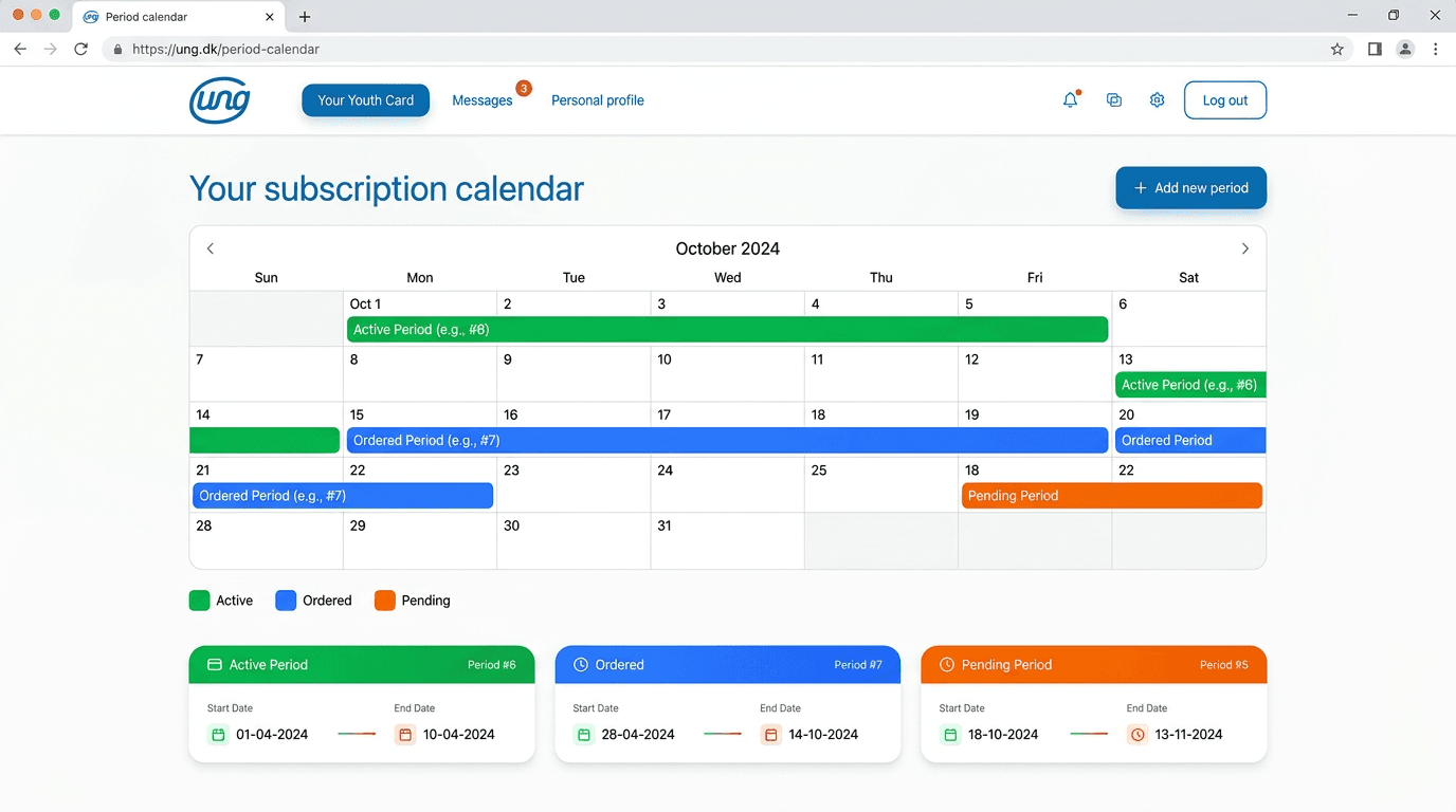
Redesigned Web Calendar & Renewal
Redesigned Active Digital Card
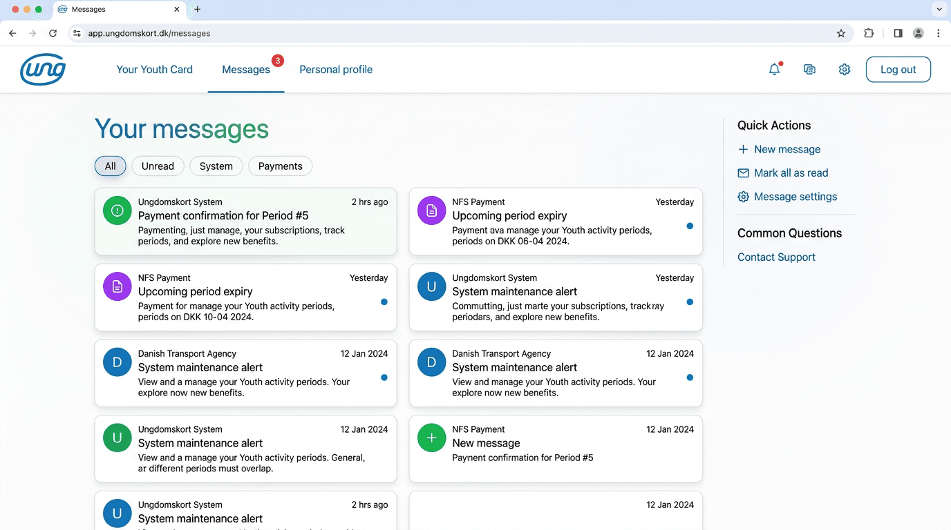
Redesigned Student Message Center
Scalable Visual Infrastructure
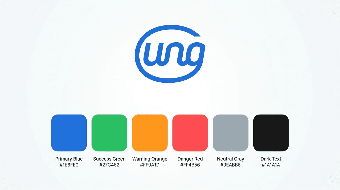
Color Palette & Contrast Ratios
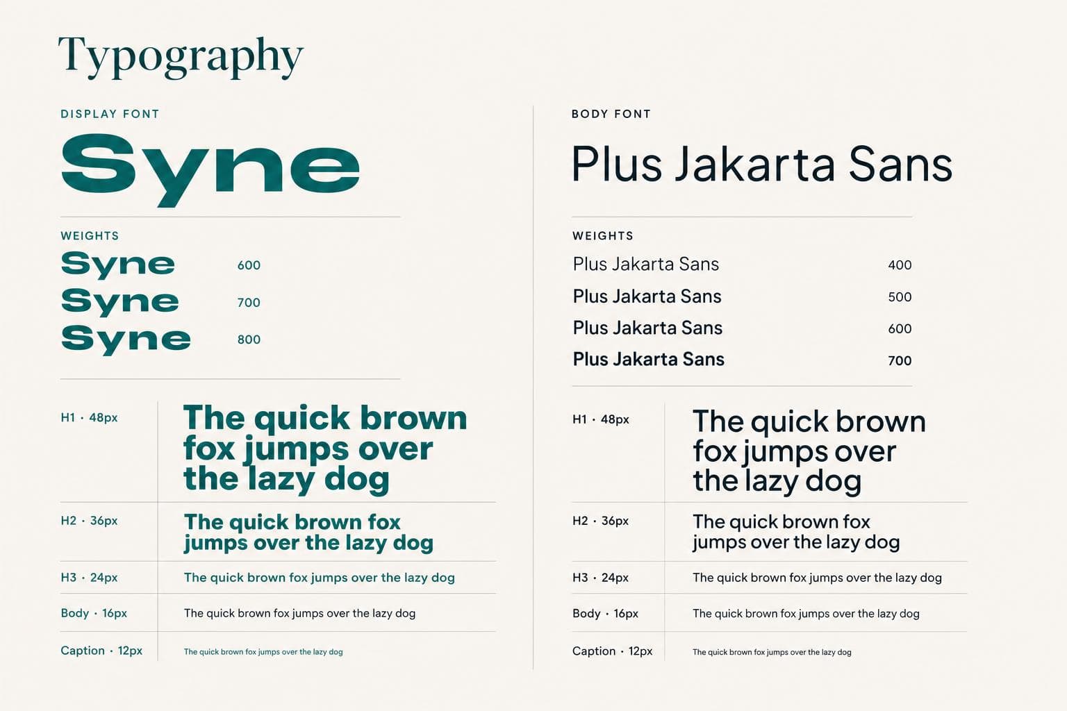
Typography Hierarchy
Core Screens Breakdown
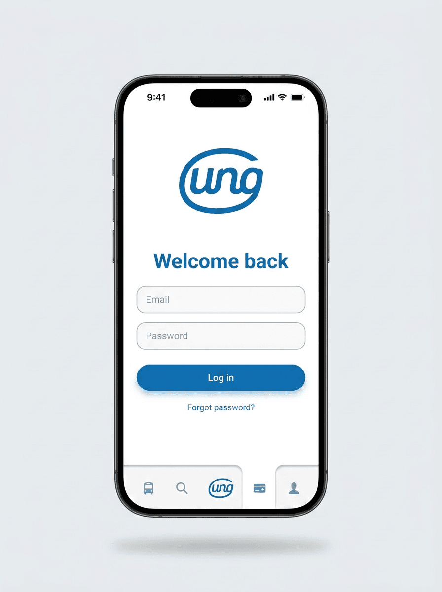
Mobile Login & MitID
Biometric and MitID single sign-on onboarding.
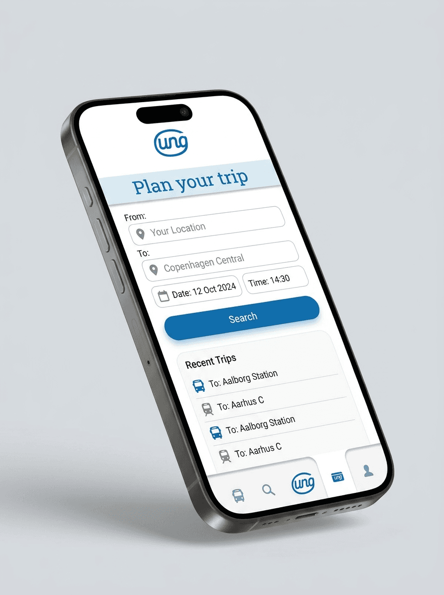
Zone & Pass Selector
Interactive map and automated price calculator.
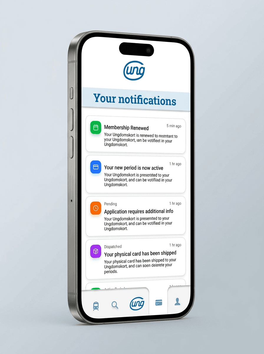
Notification Hub
Timely alerts for pass expiration and renewal status.
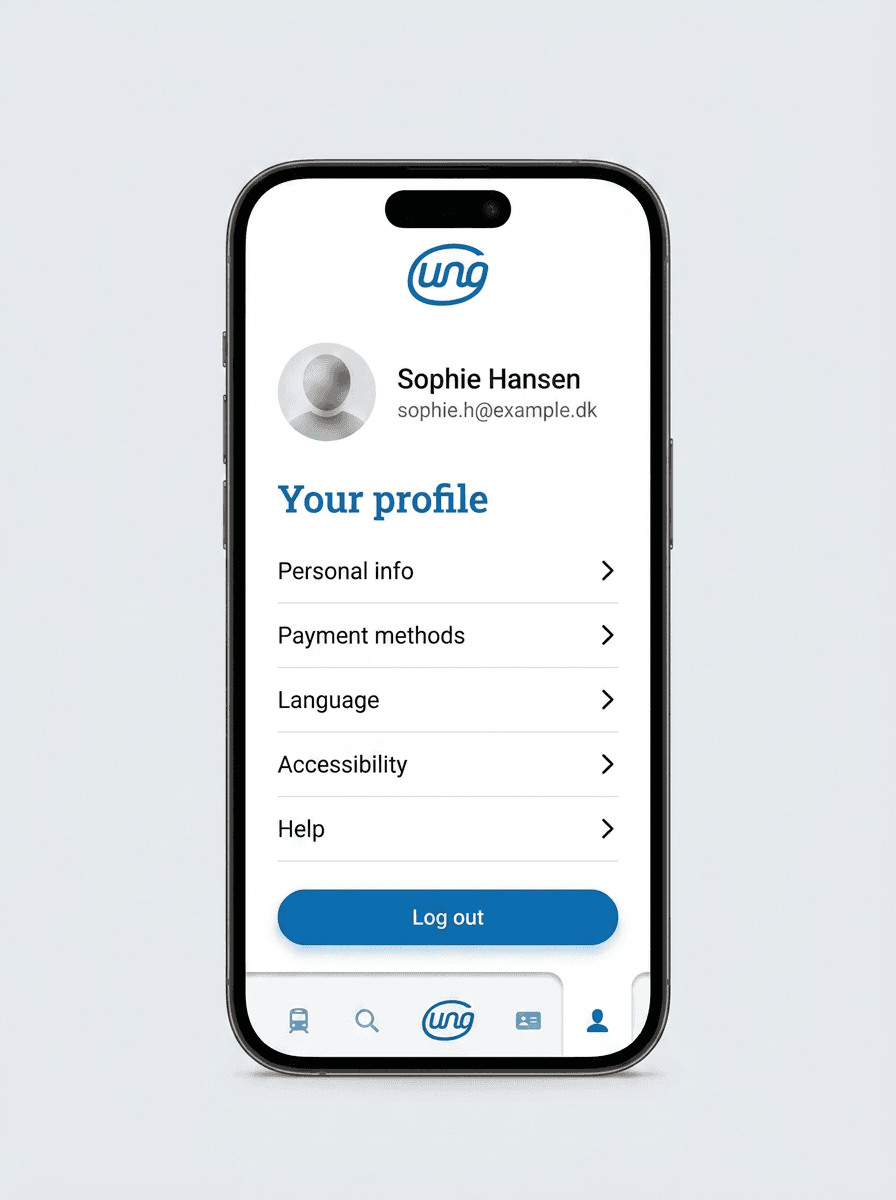
Profile & Student ID
Digital verification card with offline QR validation.
Architectural Rationale
3-Step Guided Wizard
Replaced scattered forms with a linear step progress bar that persists user input across sessions.
MitID Frictionless Auth
Embedded Danish national digital identity auth directly into step 1 to pre-fill verified student status.
High-Contrast UI System
Enforced 7:1 contrast ratio for all interactive text and controls to guarantee outdoor readability on mobile screens.
Automated Expiration Alerts
Added SMS and push notification triggers 7 days prior to pass expiration to prevent unexpected transit fines.
What This Project Taught Me
Designing for public sector software requires balancing strict compliance with delightful, modern interaction speed.
Empirical testing with real commuting students revealed that micro-copy and clear status feedback were just as critical as visual hierarchy.
Explore Other Projects

X-Bit Museum App Design
Google UX Certificate Capstone Project. A comprehensive end-to-end UX/UI design process completed as part of the Google UX Design Certificate, featuring empirical user research, wireframing, high-fidelity prototyping, and usability testing.
I Pupi Siciliani Wine E-Commerce
Full UX/UI & Custom WooCommerce Build in Odense, Denmark. End-to-end UX/UI, studio product photography, and custom WooCommerce development for a Sicilian wine retail brand in Odense, Denmark (+187% YoY profit).