
X-Bit Museum App Design
Google UX Certificate Capstone Project. A comprehensive end-to-end UX/UI design process completed as part of the Google UX Design Certificate, featuring empirical user research, wireframing, high-fidelity prototyping, and usability testing.
Role
Lead UX/UI Designer
Project Type
Mobile Application (iOS & Android)
Tools Used
Figma, Miro, Google UX Framework, Paper & Pencil
Duration
6 Months
95%
Success rate achieved during final moderated usability testing rounds.
<60s
Average time required from exhibition discovery to QR ticket generation.
Distinction
Completed with top evaluation across all 7 certification modules.

User Friction & Bottlenecks
Museum visitors struggled to browse exhibitions and book tickets in a unified experience. Existing solutions were fragmented: browsing happened on one platform, booking on another, and digital tickets were often missing. This created friction at every step of the visit.
Strategic Product Architecture
XBit is a museum companion app that unifies the visitor experience: discover current and upcoming exhibitions, book tickets with an integrated calendar and payment flow, and store digital QR tickets in one accessible interface.
Structured Methodology
Empathize
I conducted foundational UX research through competitive analysis and interview-based insights to understand how users discover exhibitions and plan museum visits. Findings showed visitors need clear scheduling, availability, and practical info before booking.
Define
I synthesized research into personas, problem statements, and a user journey map that clarified key user pain points. Defined the design challenge as creating a simple, unified experience without unnecessary steps.
Ideate
Explored multiple design directions through sketching and the Crazy Eights technique, focusing on core screens of the end-to-end journey. Selected and refined concepts that best supported intuitive navigation and readable content.
Prototype
Created digital wireframes and a high-fidelity prototype in Figma. Built a coherent visual language and complete user flow from discovery to ticket access.
Test & Iterate
Tested prototype through moderated usability sessions to identify friction points. Iterations improved clarity in the booking flow and strengthened accessibility.
Research Documentation & Artifacts
Competitive Analysis
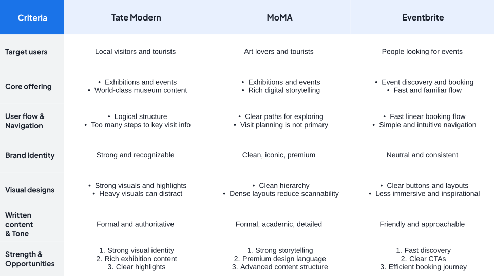
Audited key competitor apps (MoMA, Louvre, Eventbrite) to evaluate exhibition discovery, checkout speed, and digital ticketing.
User Personas
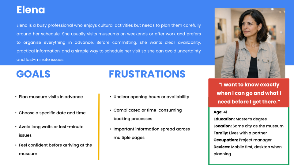
Persona 1: Culture Enthusiast
Needs detailed exhibition context and multisensory tag information.
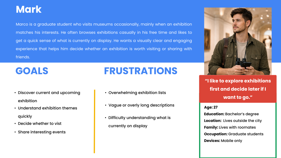
Persona 2: Busy Family Planner
Needs rapid single-screen checkout with clear group ticket selectors.
Problem Statements
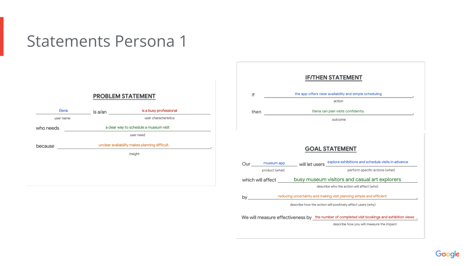
Persona 1 Problem Statement
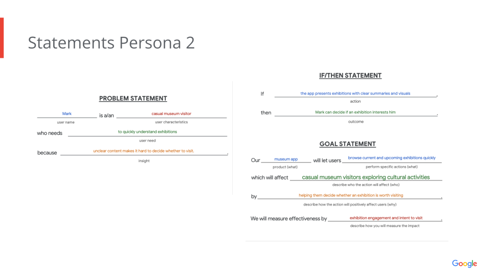
Persona 2 Problem Statement
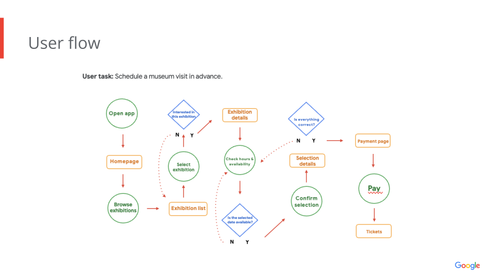
Google UX Style User Flow
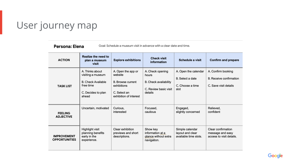
Visitor Journey Map
Five Sketches & Digital Lo-Fi Wireframes
Rapid exploration of layout alternatives before committing to digital high-fidelity.
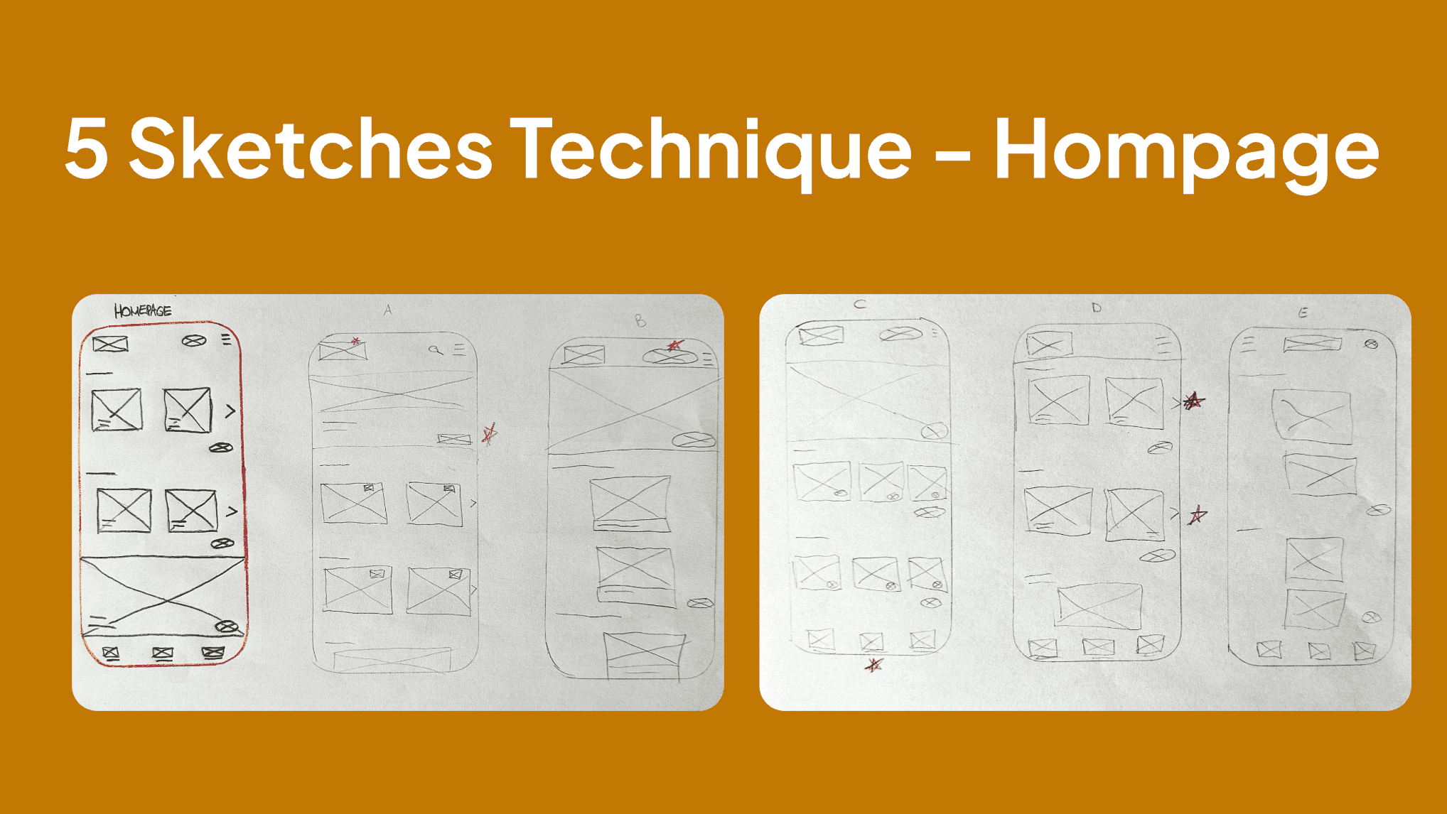
Five Sketches Technique: Homepage Layouts
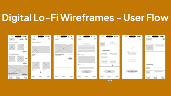
Digital Lo-Fi Wireframes: User Flow
Scalable Visual Infrastructure
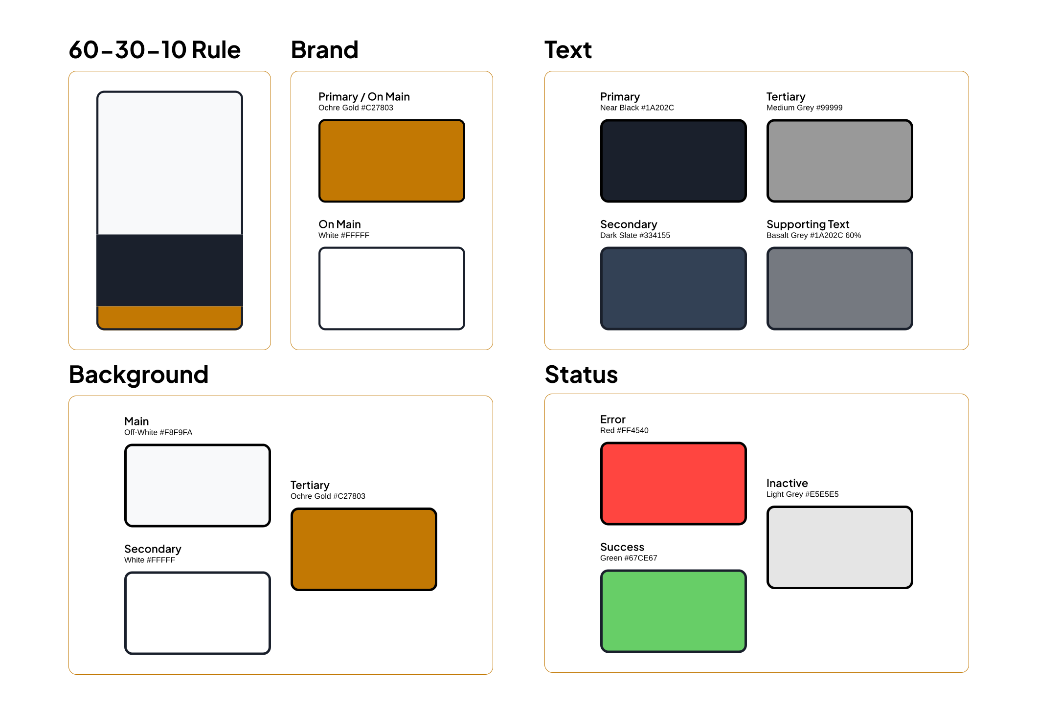
Color Palette & Contrast Ratios
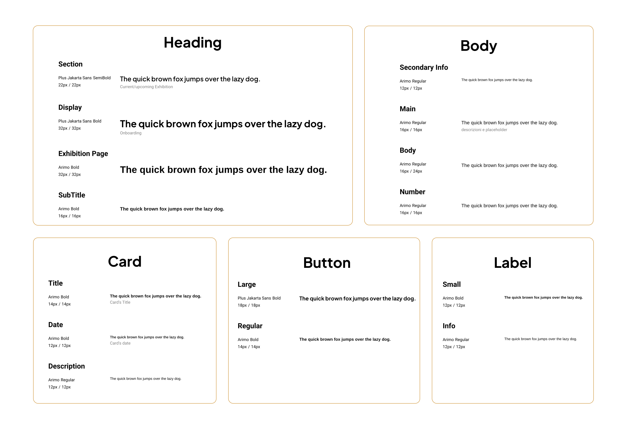
Typography Hierarchy
Mobile Application Experience (iPhone 14 Pro)

Onboarding Splash
Login / Sign Up with email, Facebook, or Google.
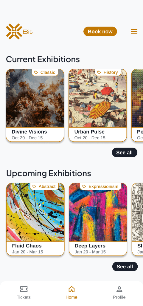
Home Feed
Current & upcoming exhibitions with pill category filters.
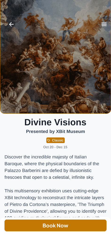
Exhibition Detail
Hero media, description, and multisensory tags (VR, AR).
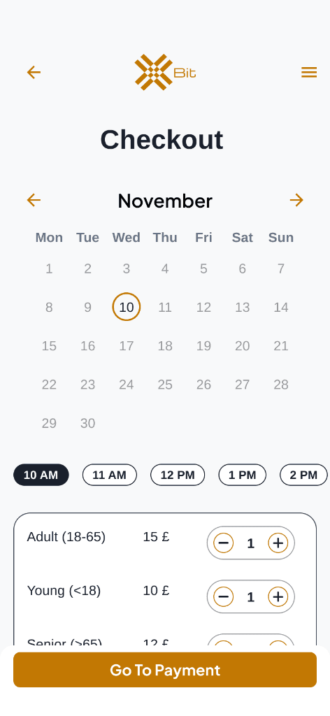
Unified Checkout
Date picker, time slot, and ticket quantity on one screen.
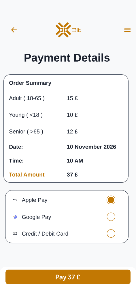
Payment Confirmation
Summary with Apple Pay, Google Pay, and credit card.
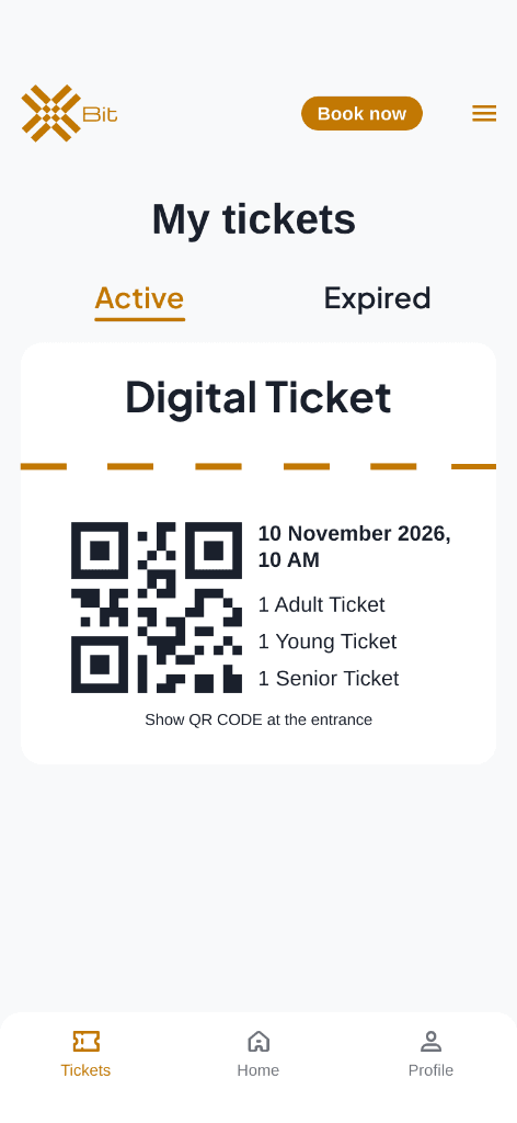
Digital Ticket Pass
QR code ticket stored under Active / Expired tabs.
Architectural Rationale
Persistent Bottom Tab Bar
A 3-tab bar (Tickets, Home, Profile) keeps core actions accessible within 2 taps from any view.
Unified Checkout Screen
Combined date, time, and ticket selection onto a single screen to eliminate drop-off.
Warm Amber Brand Identity
#C27803 warm amber was selected to evoke gallery lighting and cultural prestige.
QR Code Wallet Integration
Digital tickets feature instant QR code expansion for rapid scanning at museum turnstiles.
What This Project Taught Me
Early low-fidelity paper wireframing surfaced structural navigation issues that saved weeks of high-fidelity revisions.
Building a tokenized Figma component library upfront made post-usability testing iterations instantaneous.
Explore the interactive file directly
Explore Other Projects
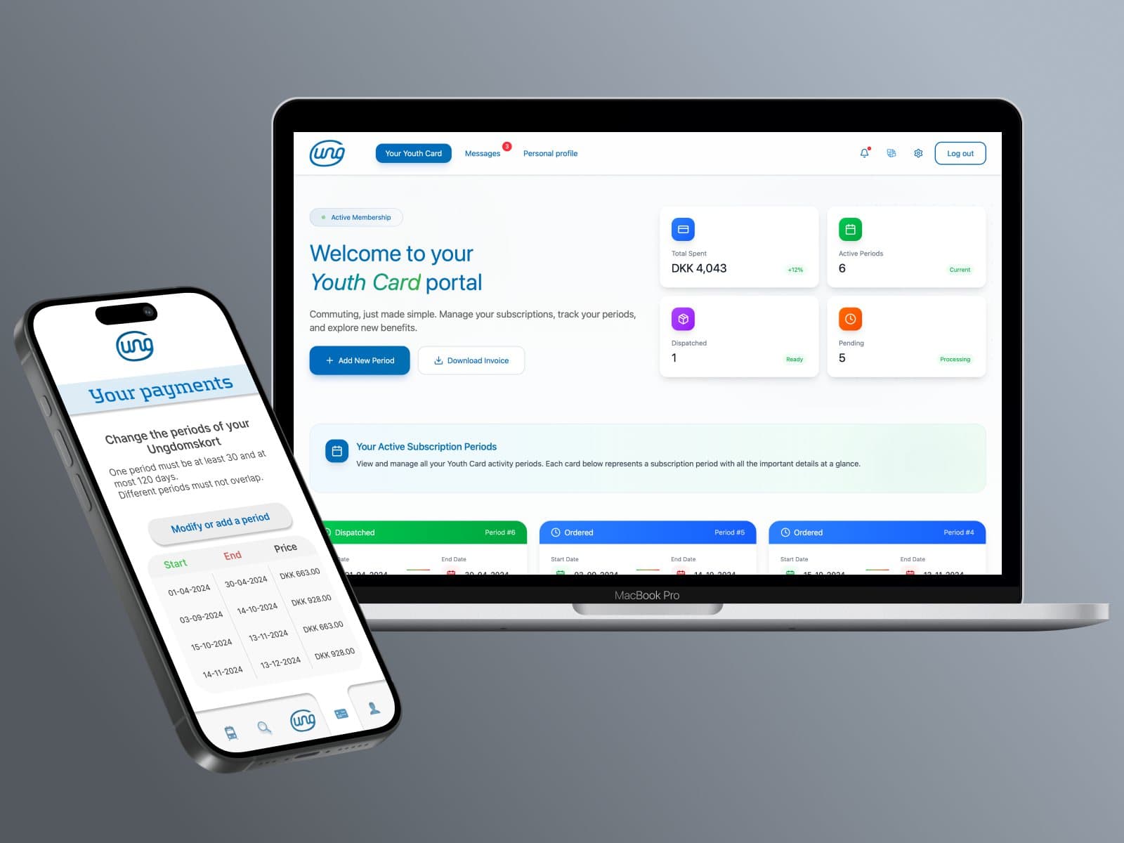
Ungdomskort: Transit Redesign
National Danish Student Travel Pass Overhaul. Website and mobile app redesign for Denmark’s national student transit service, solving payment complexity, mobile responsiveness, and enforcing strict WCAG 2.2 AA compliance.
I Pupi Siciliani Wine E-Commerce
Full UX/UI & Custom WooCommerce Build in Odense, Denmark. End-to-end UX/UI, studio product photography, and custom WooCommerce development for a Sicilian wine retail brand in Odense, Denmark (+187% YoY profit).