
Sydbank Enterprise Data Catalog Redesign
Enterprise UX Research and UI Overhaul at Denmark's 4th Largest Bank. Enterprise UX research and 4-block UI redesign of Sydbank's internal Alation data catalog software. Driven by an empirical 24-person survey across bank departments, user journey mapping, and ISO 9241-210 human-centered evaluation.
Role
Lead Enterprise UX Analyst & Front-End UI Designer
Project Type
Sydbank Enterprise Data Infrastructure
Tools Used
Alation Data Catalog, ISO 9241-210, ISO 9126 Quality Model, Norman 3 Levels, Figma, Empirical Likert Surveys
Duration
5 Months
Direct Ownership Highlights:
- Homepage Architecture (3-Zone Layout & Quick Action Cards)
- Faceted Search Bar (Integrated Recent Items & Category Filters)
- Onboarding & Support Hub (Embedded Video Tutorial Modals)
- Empirical Research Synthesis (N=24 Employee Survey Analysis)
Accessibility & Enterprise Badges:
3.5 / 5
Standard Deviation: 0.72 (Empirical baseline metrics from 24 active Sydbank employees).
3.21 / 5
Standard Deviation: 0.88 (Targeted cognitive load reduction & training speedup).
-66%
Task resolution duration reduced from 90 min down to 30 min per data query task.
N=24 Users
Cross-departmental sample size ranging from new hires to senior database admins.
User Friction & Bottlenecks
Sydbank relies on the Alation Data Catalog platform to facilitate database-related operations, metadata tracking, and query management across financial departments. However, newly hired employees consistently encountered a steep learning curve and operational friction due to cluttered layouts, ambiguous color-coded status icons, hardcoded Danish text, and hidden help resources.
Strategic Product Architecture
Conducted an empirical survey with 24 active Alation users across Sydbank departments to capture quantitative Likert scale metrics alongside qualitative feedback. Redesigned the platform into 4 core UI blocks: Homepage Modernization, Centralized Database Navigation, Prominent Tutorial Hub, and Faceted Domain Search with integrated recent history.
Structured Methodology
Empirical Baseline Survey (N=24)
Distributed an internal questionnaire to 24 active Alation users across Sydbank financial departments, capturing quantitative Likert scale metrics alongside qualitative friction points.
Qualitative Sentiments & Journey Mapping
Mapped core pain points across New Employee and Senior User journeys: interface complexity, onboarding bottlenecks, hardcoded language friction, and documentation gaps.
ISO 9241-210 & ISO 9126 Frameworks
Applied ISO 9241-210 (Human-Centered Design) & ISO 9126 (Learnability, Operability, Compliance), Norman's 3 Processing Levels (Visceral, Behavioral, Reflective), and continuous stakeholder feedback loops.
Stanford d.school Wireframing
Explored physical paper sketches (Stage 1) and digital low-fidelity information architecture (Stage 2) prior to high-fidelity implementation.
Stanford d.school Framework & Wireframes
Moving from physical paper exploration to digital low-fidelity information architecture.
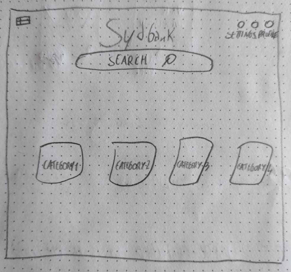
Stage 1 · Physical Wireframe Sketch
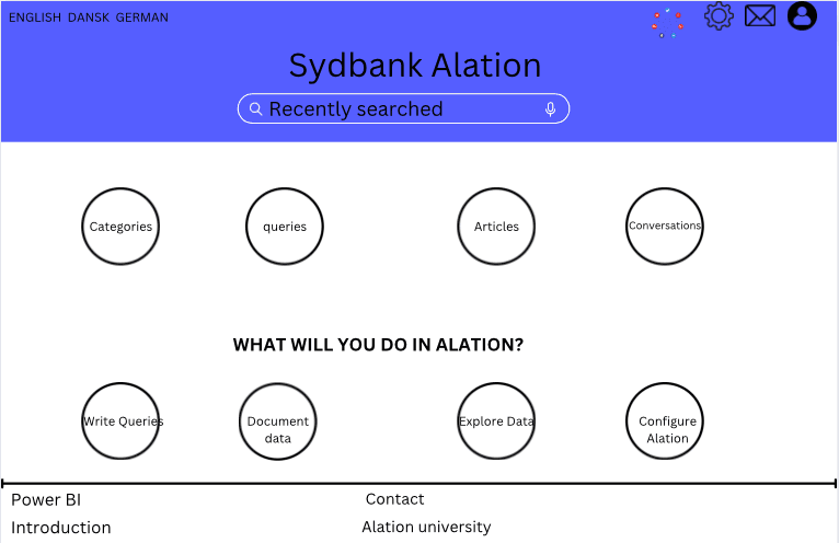
Stage 2 · Digital Low-Fi Wireframe
Interface Transformation (Before vs After)
Homepage Modernization & Multi-Language Switcher
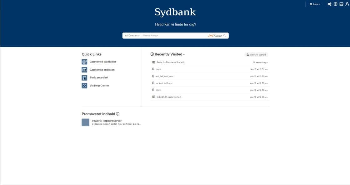
BEFORE · Cluttered 3-column legacy layout, hardcoded Danish text, hidden help documentation.
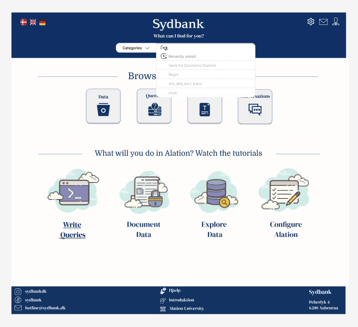
AFTER · Clear 3-zone layout with quick links, prominent onboarding hub, and top-level DA/EN/DE language switcher.
Centralized Database Navigation & Superuser Directory
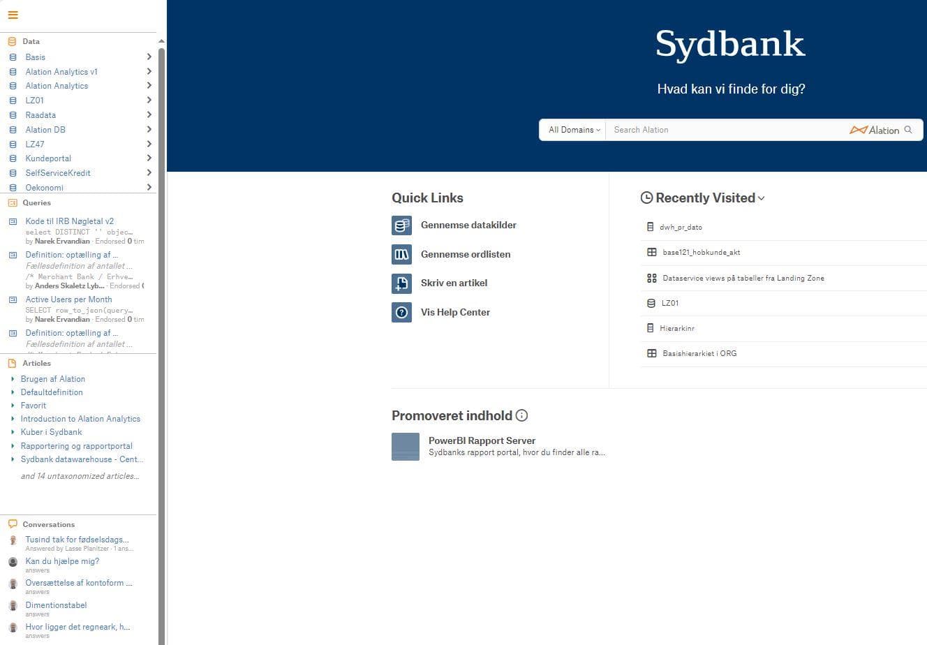
BEFORE · Disconnected navigation in unconventional positions without clear domain categories.
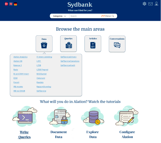
AFTER · Centralized 4-category navigation bar with icons, structured dropdowns, and superuser contact directory.
Prominent Tutorial Hub & Guided Video Walkthroughs
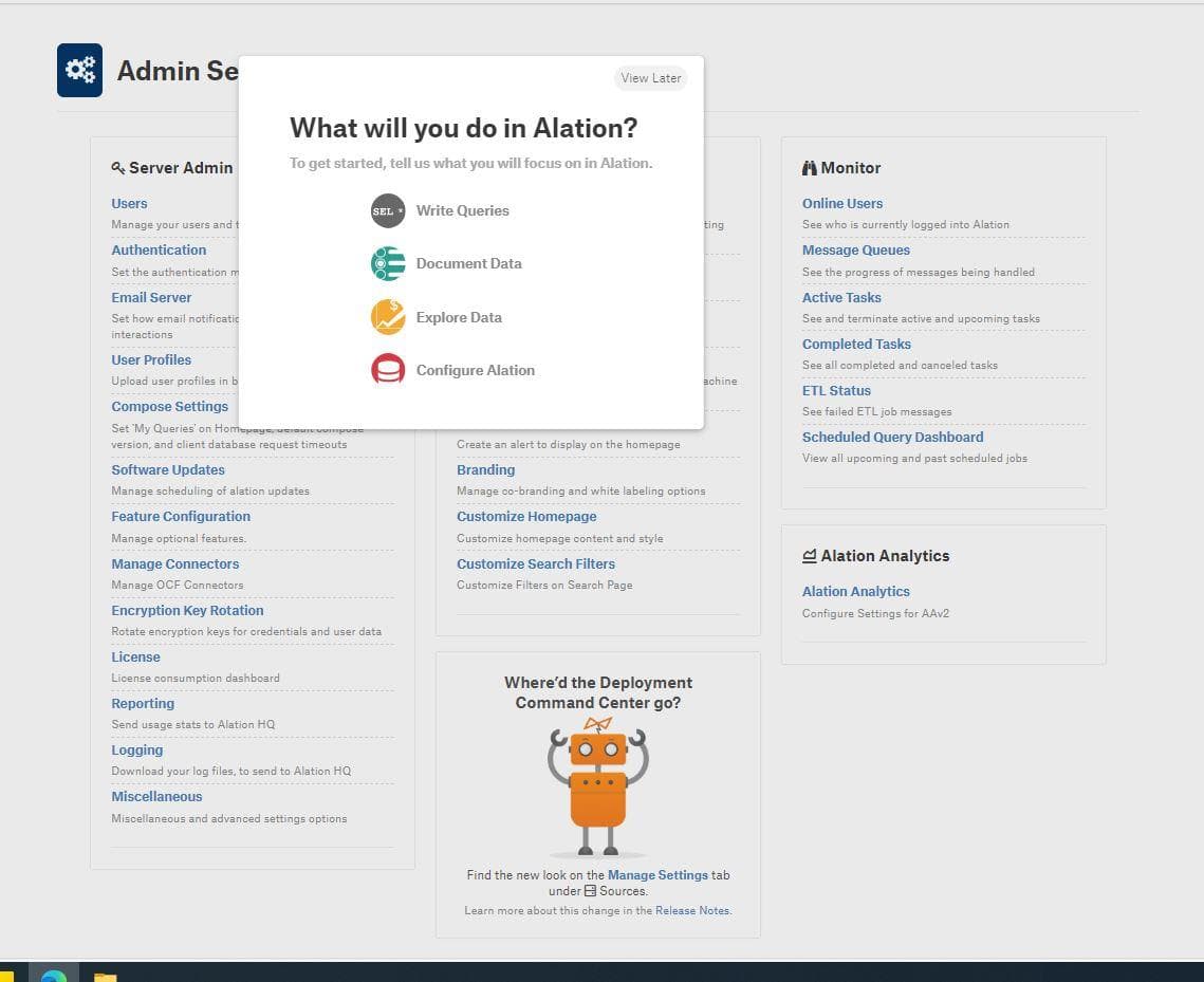
BEFORE · Onboarding hidden inside nested admin setting menus.
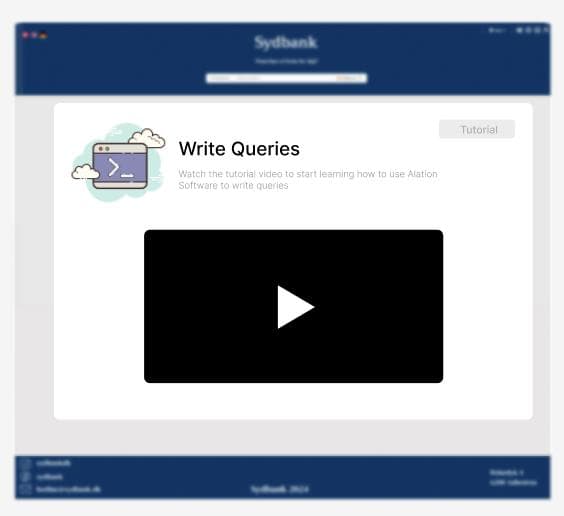
AFTER · Centered action cards ('Write Queries', 'Document Data', 'Explore Data', 'Configure Alation') with direct video modals.
Faceted Search Bar & Integrated Recent History
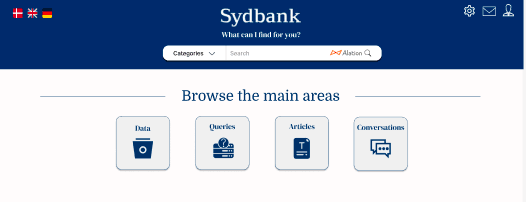
BEFORE · Confusing 'All Domains' label and disconnected recent items history.
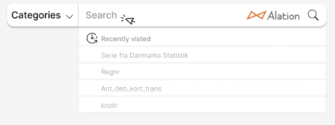
AFTER · Rebranded dropdown ('Categories'), integrated 'Recently Visited' history directly inside search bar, and faceted domain filters.
Architectural Rationale
Personal Deliverables Ownership
Direct ownership of Homepage Redesign, Search Bar & Recent History, Onboarding & Video Hub, and N=24 Data Synthesis.
ISO 9241-210 & ISO 9126 Standards
Human-centered design framework evaluating Learnability, Operability, Attractiveness, and Compliance.
Norman 3 Processing Levels
Addressing Visceral (first impressions), Behavioral (core usability), and Reflective (long-term satisfaction).
Embedded Video Tutorial Hub
Prominent tutorial banners directly on homepage eliminated reliance on external documentation decks.
What This Project Taught Me
Empirical N=24 Likert scale metrics paired with qualitative user feedback provide bulletproof evidence when redesigning enterprise banking software.
Structuring complex database catalogs into 4 clear UI blocks reduces cognitive load for both new hires and senior analysts.
Multi-language localization (Danish, English, German) is a major UX strategy in international banking environments.
Explore Other Projects
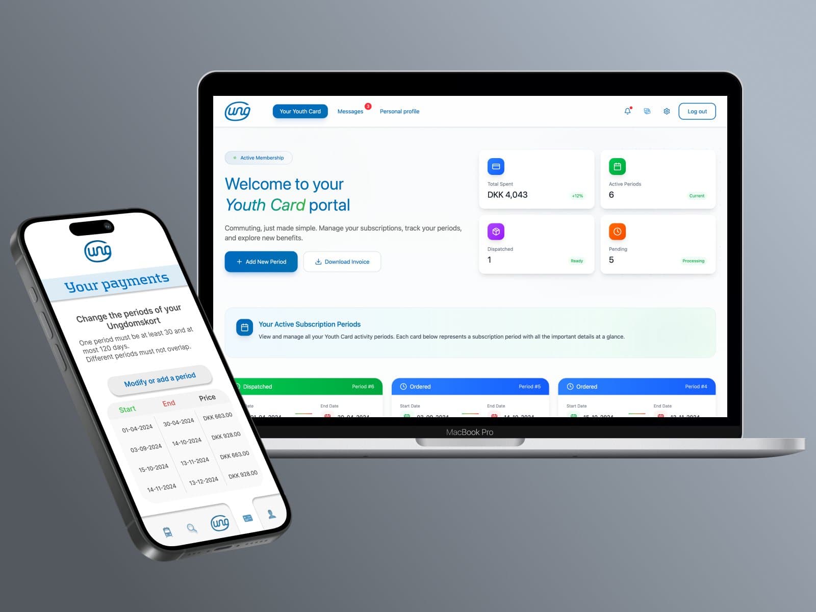
Ungdomskort: Transit Redesign
National Danish Student Travel Pass Overhaul. Website and mobile app redesign for Denmark’s national student transit service, solving payment complexity, mobile responsiveness, and enforcing strict WCAG 2.2 AA compliance.
X-Bit Museum App Design
Google UX Certificate Capstone Project. A comprehensive end-to-end UX/UI design process completed as part of the Google UX Design Certificate, featuring empirical user research, wireframing, high-fidelity prototyping, and usability testing.