
Tutora EdTech Platform
End-to-End UX/UI & Scalable Figma Design System. A complete UX/UI design for a tutoring platform, from user research and competitive analysis to a scalable design system and interactive Figma prototypes. Completed for Google UX Professional Certificate on Coursera.
Role
UX/UI Designer & Design System Lead
Project Type
Web & Mobile App Platform
Tools Used
Figma, Miro, Adobe Illustrator, Nano Banana Pro AI
Duration
8 Months
120+
Reusable color, typography, elevation, and component tokens.
6 Core
Dual-interface design for both Parent and Tutor user roles.
Completed
Top rating across all 7 Google UX specialization modules.
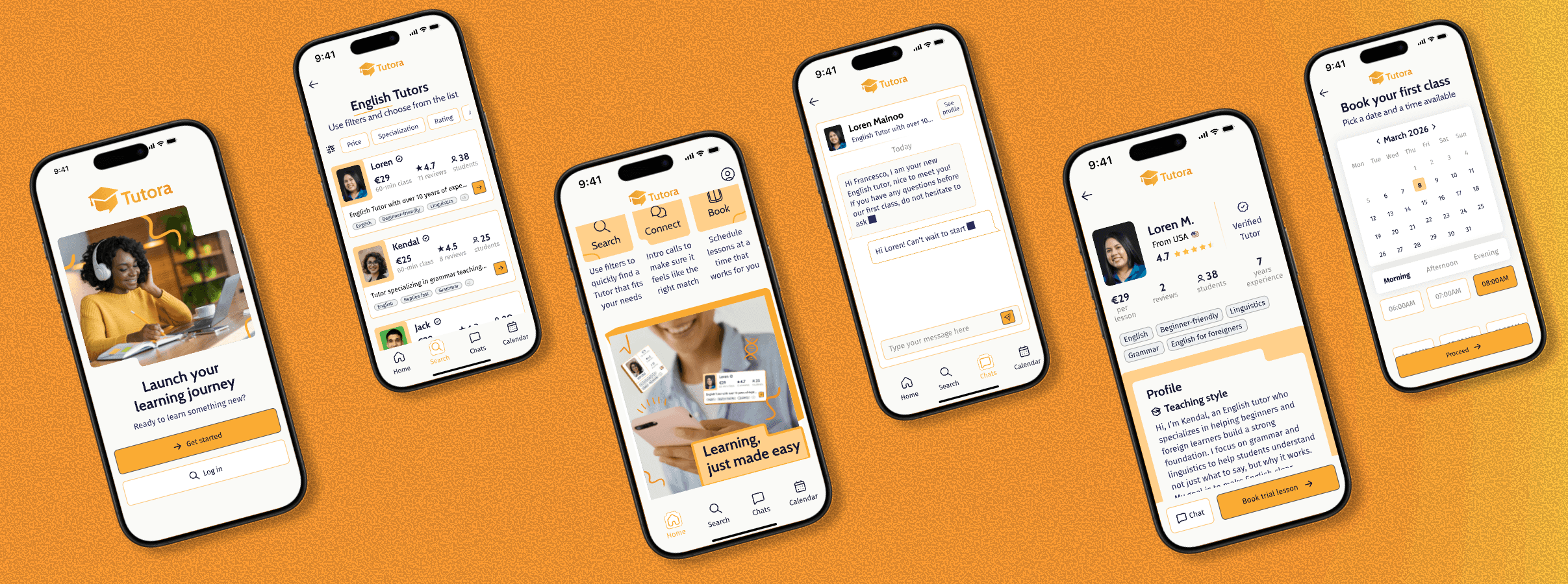
User Friction & Bottlenecks
Parents struggle to find qualified tutors that match their children's learning needs. Existing platforms are fragmented, difficult to navigate, and lack transparency about tutor qualifications. Tutors face friction managing profiles, availability, and bookings across platforms.
Strategic Product Architecture
Tutora is a unified platform that makes it easy for parents to discover, evaluate, and book qualified tutors. Advanced search and filtering help parents find the right match, while an integrated calendar and messaging system simplify scheduling and communication.
Structured Methodology
User Research
Conducted user research to identify common pain points target users encounter when searching for tutors online. Identified primary user groups: parents seeking tutors and tutors offering services. Developed two personas representing each group with their unique needs and frustrations.
Define
Created personas (Parent, Tutor), user stories, and user flows to understand user motivations and frustrations. Defined problem statements for each persona and a goal statement for the product. Conducted competitive analysis of platforms like Preply, Wyzant, and Superprof.
Ideate
Mapped out user flows for parents and tutors on Miro, covering the complete journey from registration to session booking. Created paper wireframes to visualize layout structures and experiment with different navigation patterns and solutions.
Design System
Developed a scalable Design System in Figma, defining core visual elements, typography hierarchy, color palette (using 60-30-10 rule), icons, grids, and reusable components for consistency and efficiency across all screens.
High-Fidelity Prototypes
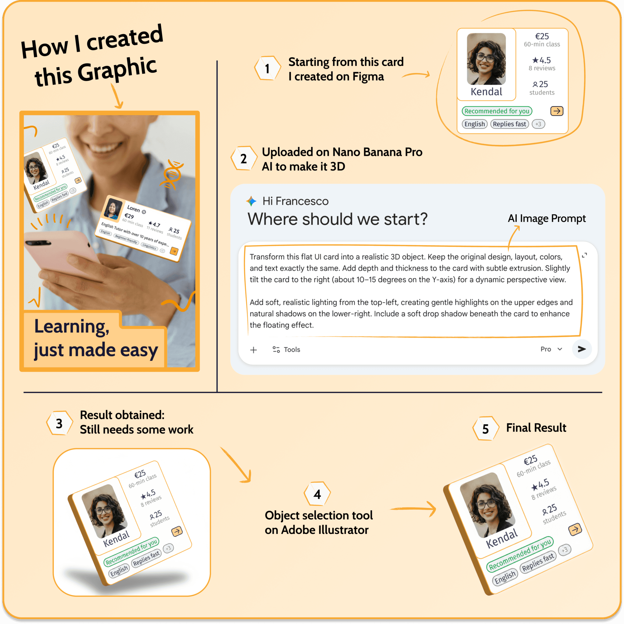
Created digital mockups and interactive prototypes for onboarding, booking flows, search, calendar, and settings screens. Incorporated AI-generated 3D objects refined in Adobe Illustrator to enhance visual appeal and match design aesthetics.
Testing & Iteration
Integrated accessibility throughout the design process and conducted iterative testing with users to refine the experience. Refined the interface based on feedback with a strong focus on accessibility (WCAG guidelines) and usability.
Research Documentation & Artifacts
User Groups
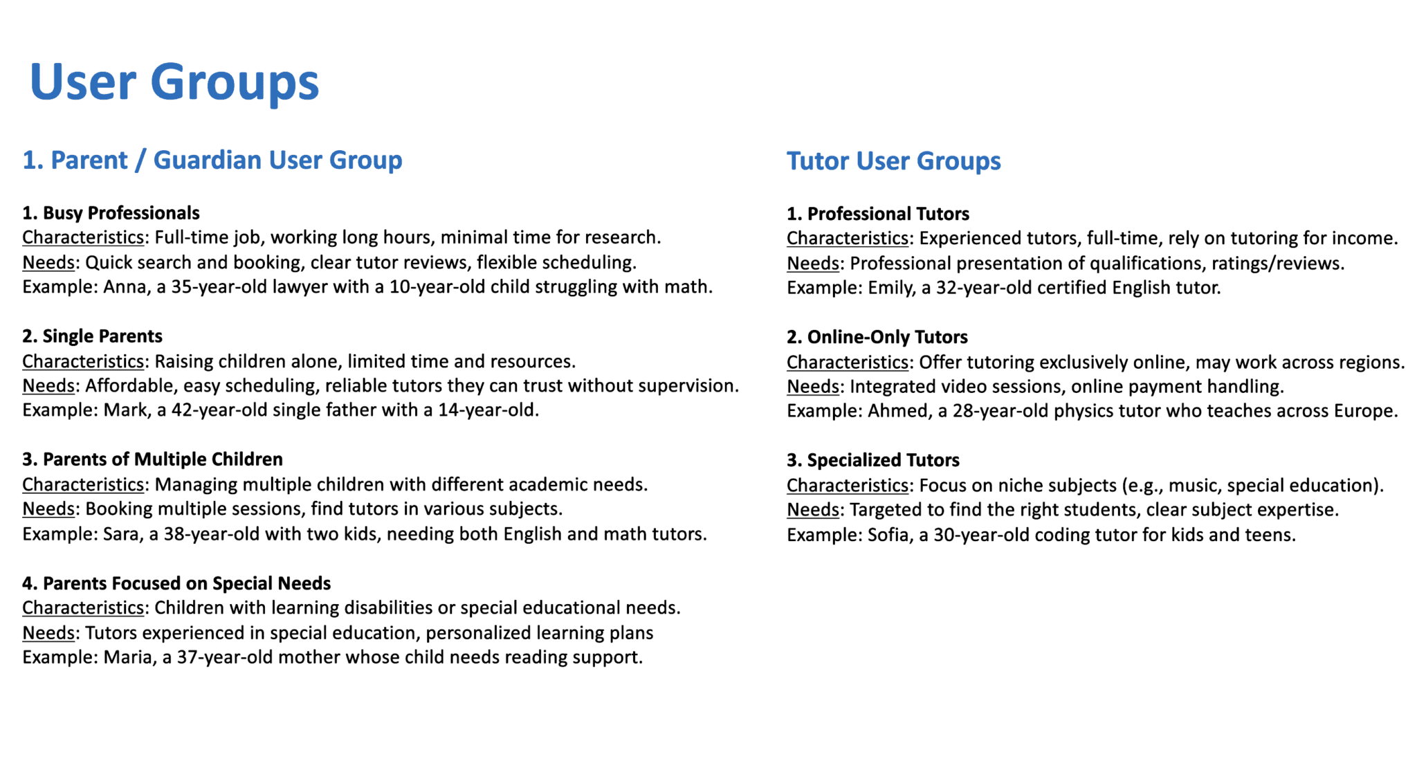
User Groups: Parents and Tutors
Competitive Analysis
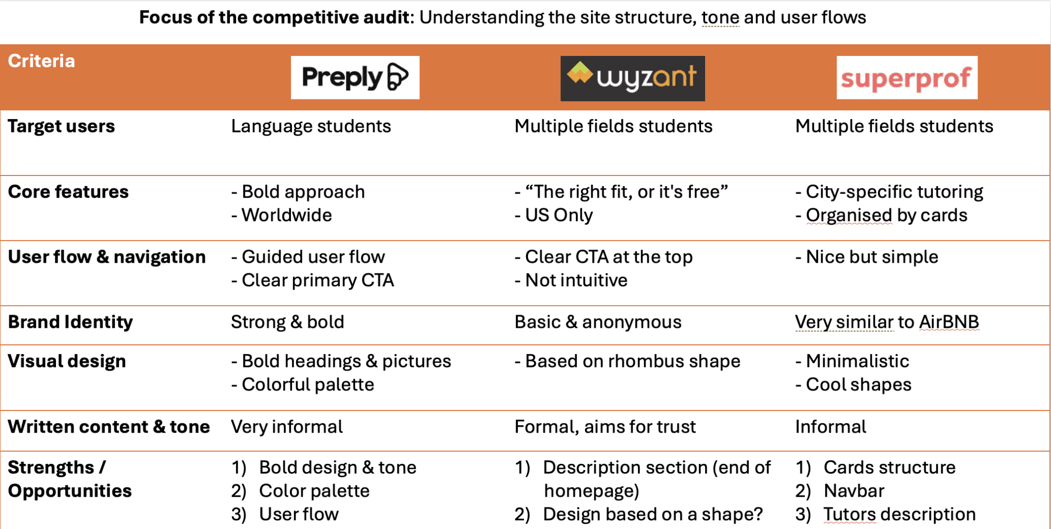
Audited Preply, Wyzant, and Superprof across 14 key UX criteria including search friction and profile transparency.
User Personas
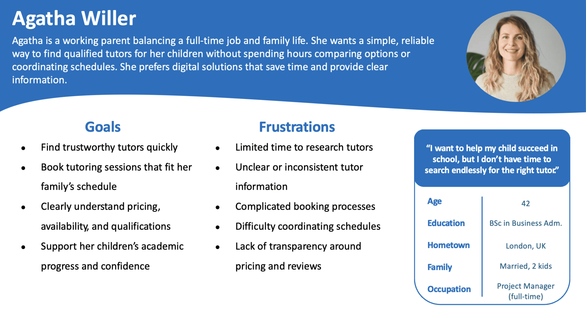
Parent Persona (Sarah)
Focuses on safety, qualifications, transparent reviews, and easy calendar booking.
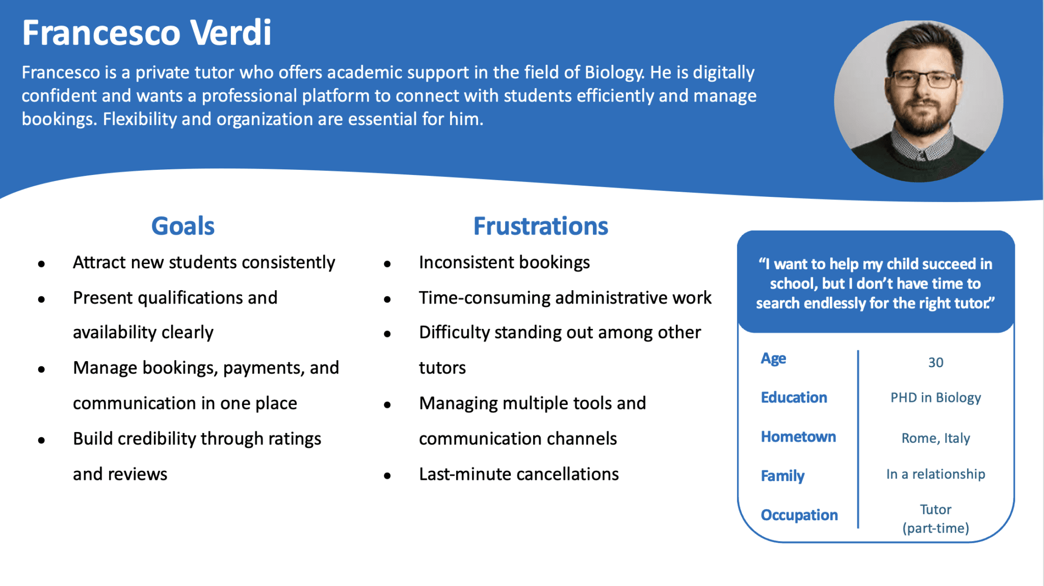
Tutor Persona (David)
Focuses on hourly rates, schedule flexibility, and direct client messaging.
Problem Statements
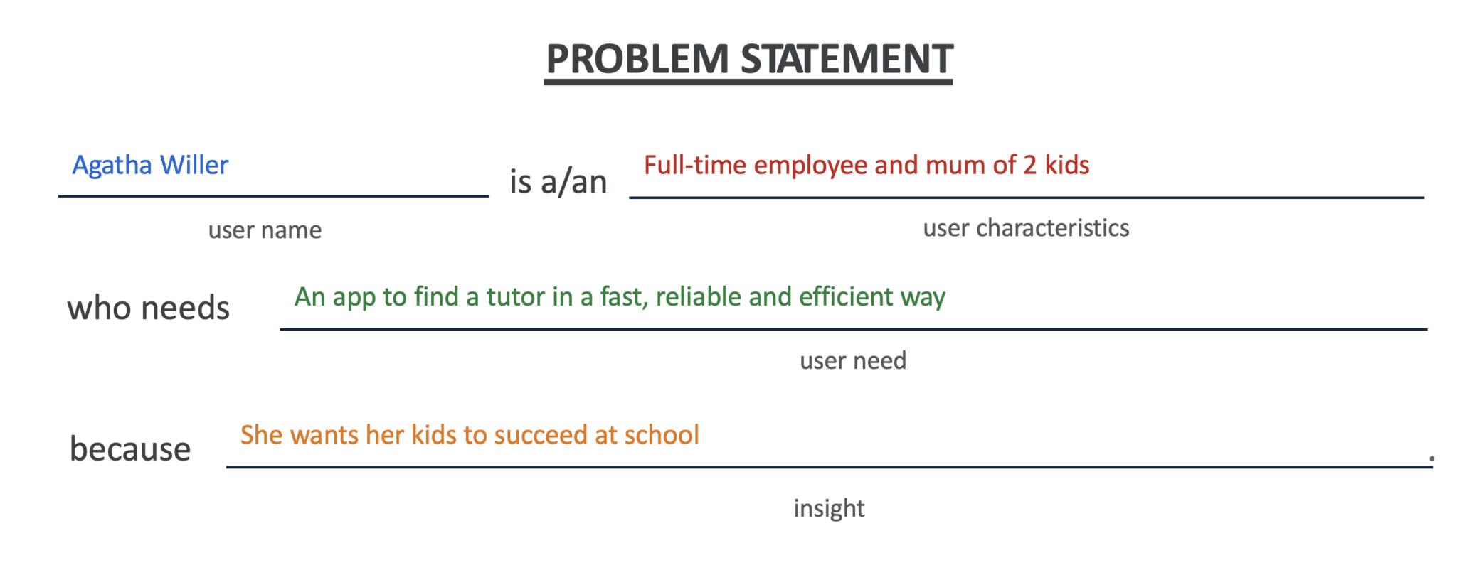
Parent Problem Statement
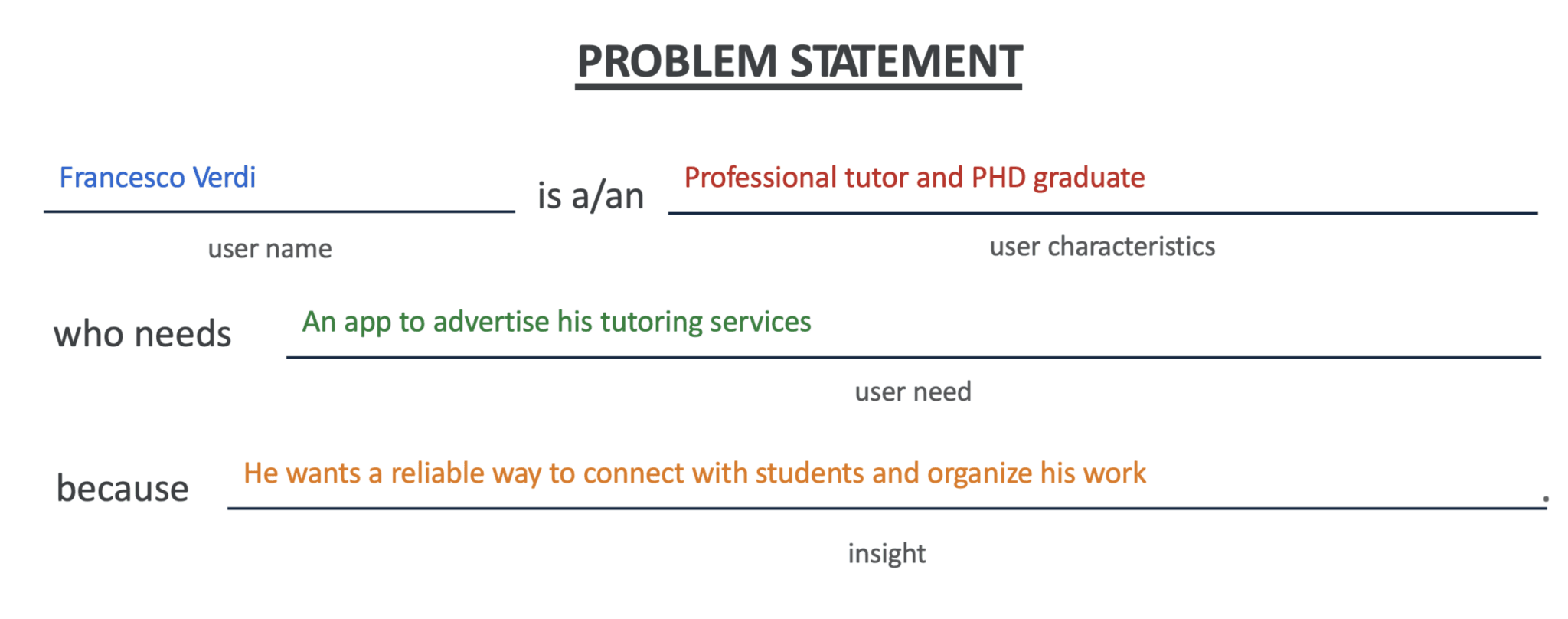
Tutor Problem Statement
Product Goal Statement
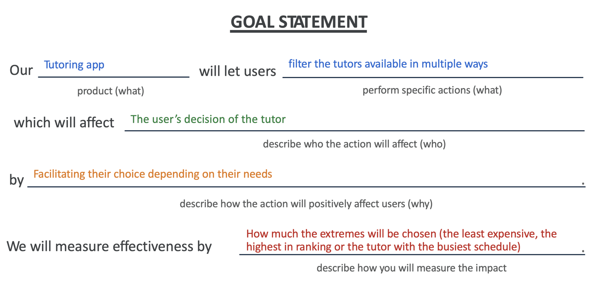
Product Goal Statement
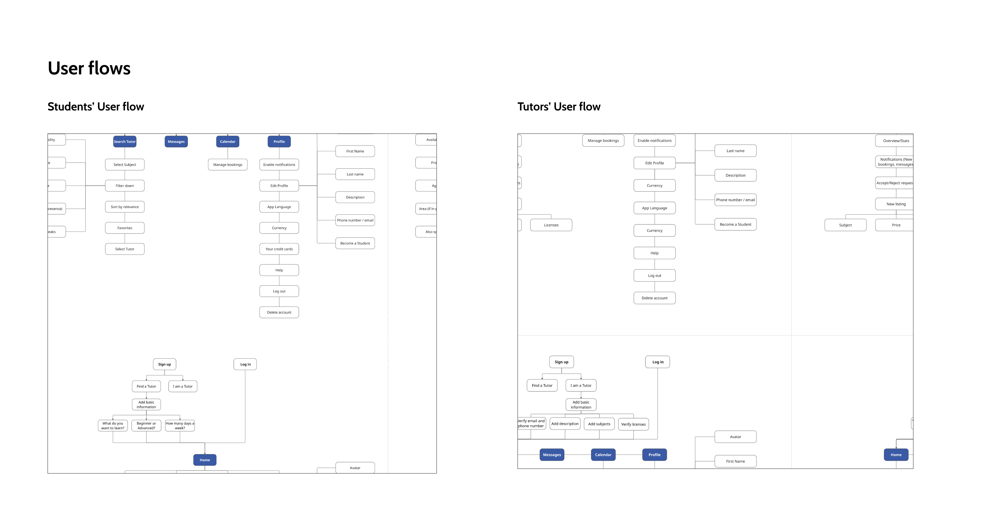
Complete Parent & Tutor User Flows
From Sketch to Structure: Paper Wireframes
Low-fidelity exploration of dual-user layout structures and navigation patterns before committing to digital UI.
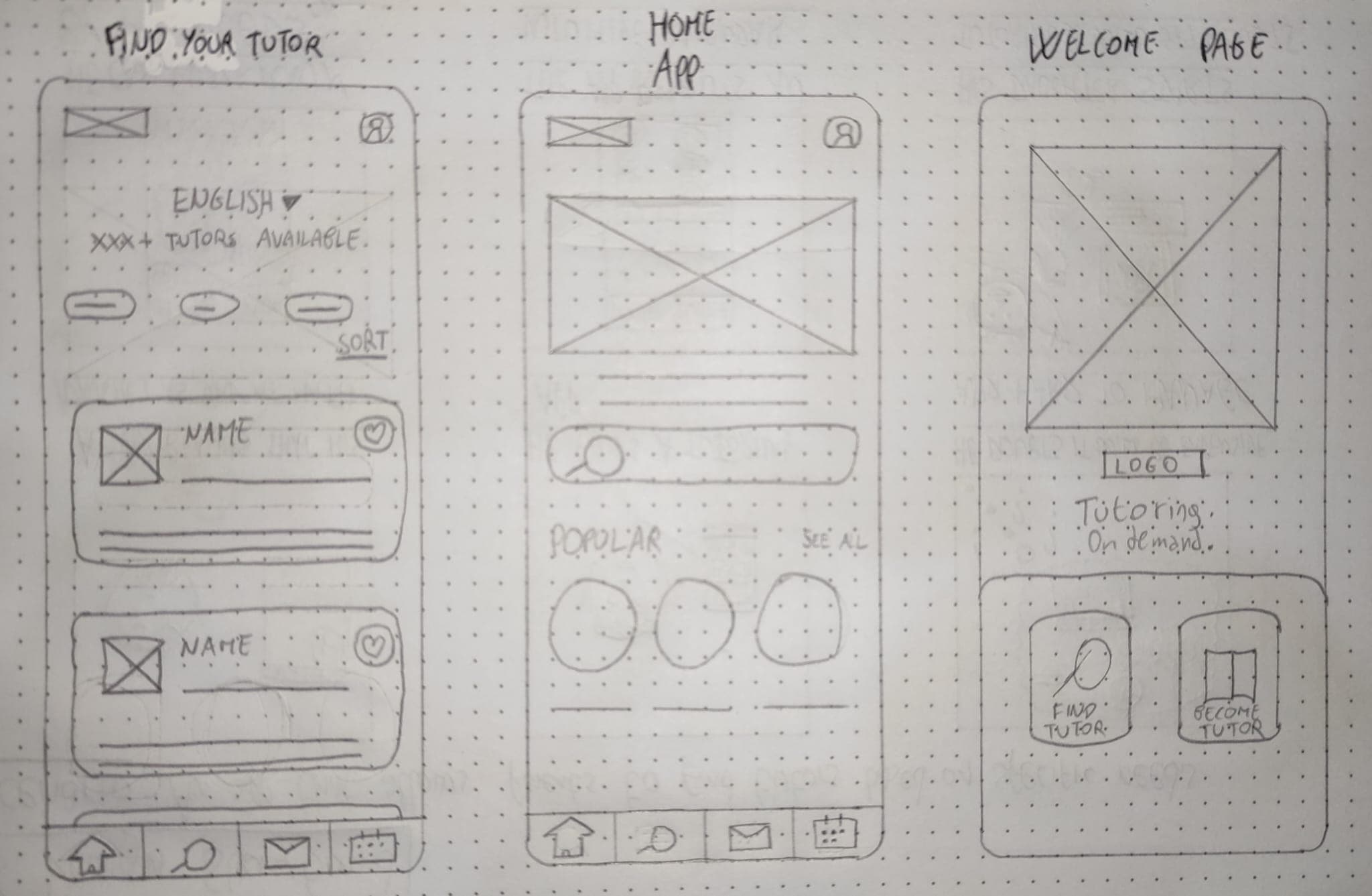
Paper Wireframes & Layout Concepts
Scalable Visual Infrastructure
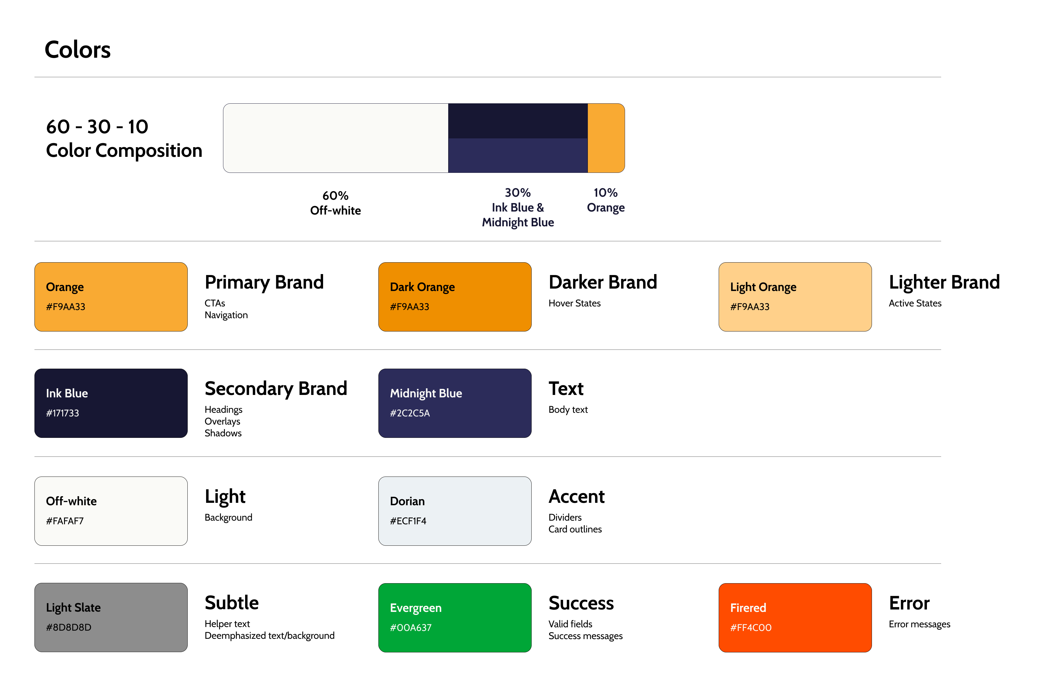
Color Palette & Contrast Ratios
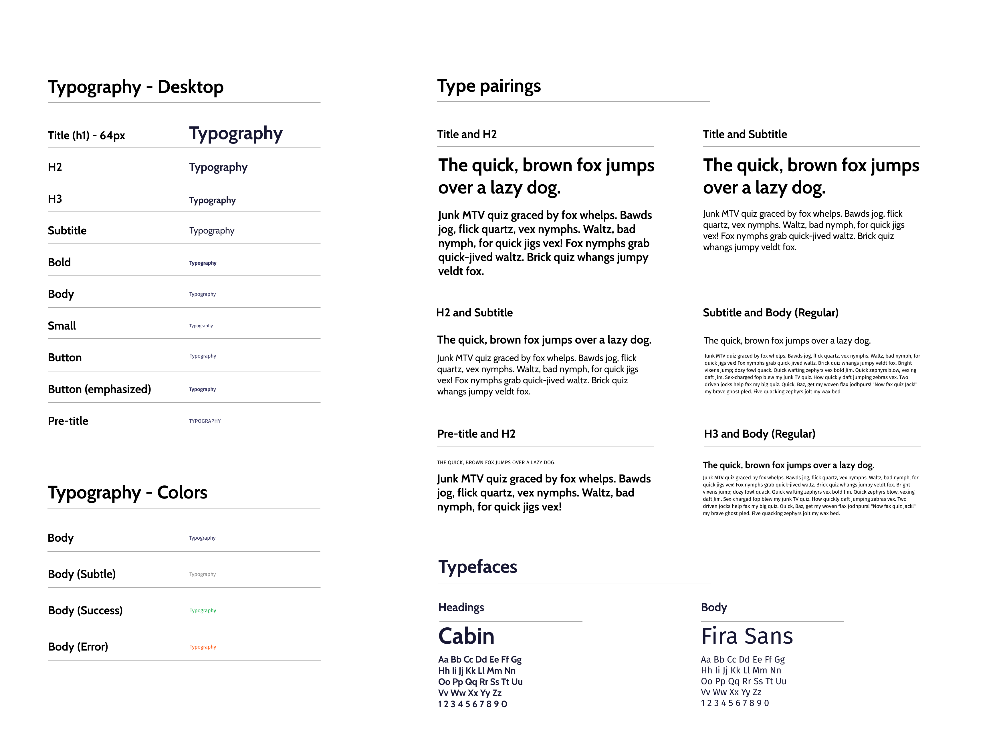
Typography Hierarchy
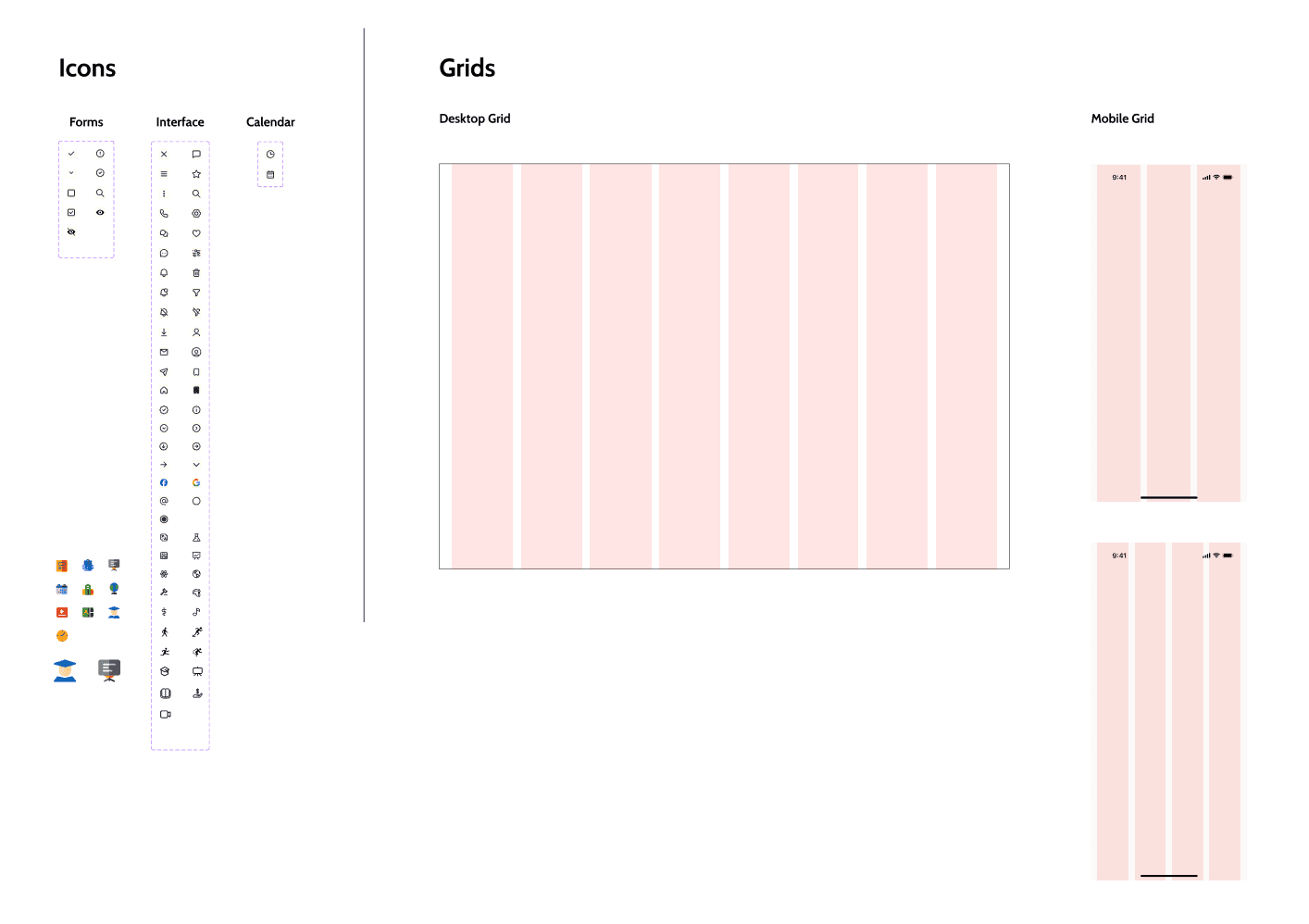
Icons & Grid Alignment System
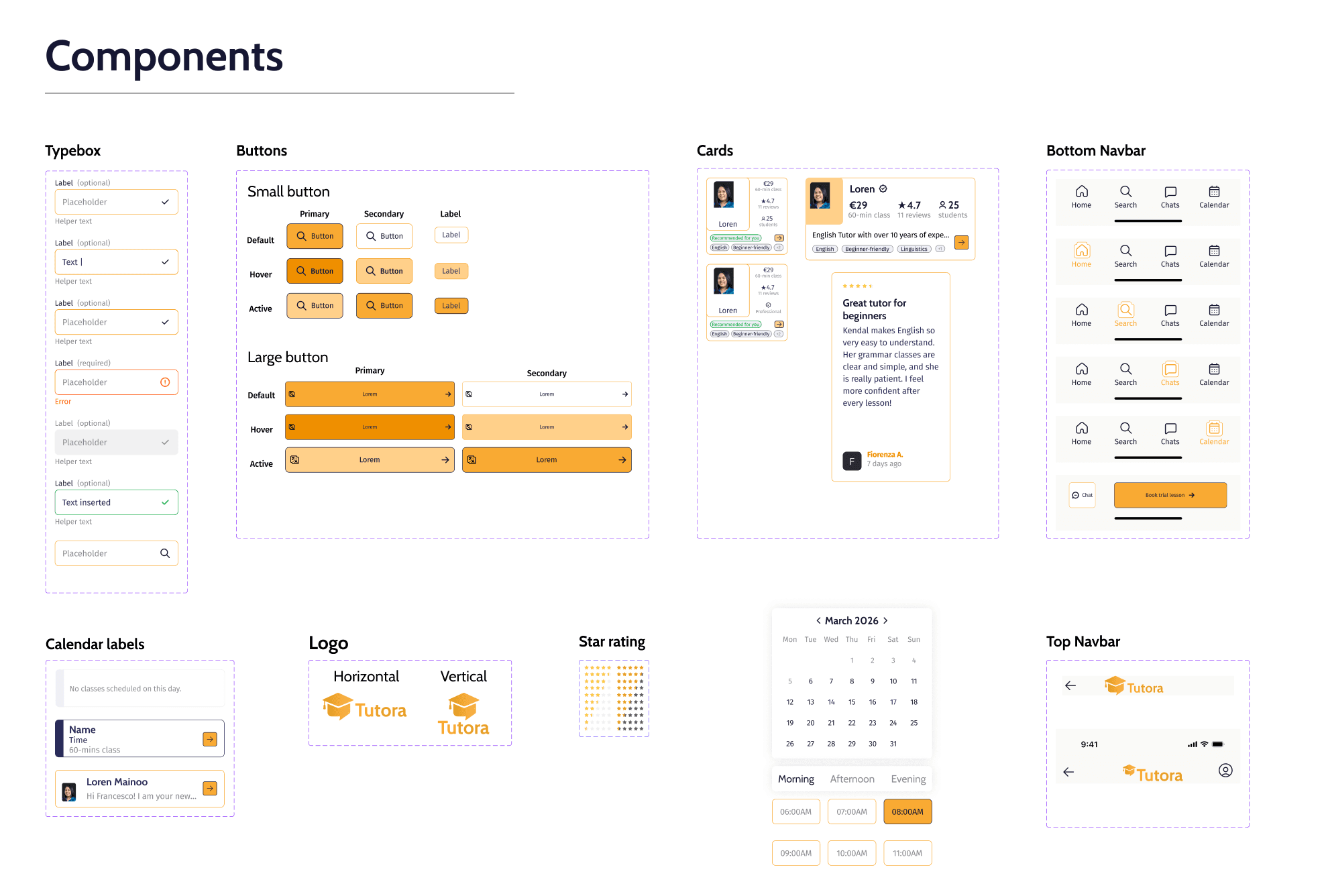
Figma Reusable Component Library
AI Image Creation & 3D Visual Assets
To enhance the visual appeal of the interface, Nano Banana Pro AI was used to generate 3D educational objects aligned with the app aesthetic. These assets were then refined in Adobe Illustrator to ensure they matched the overall design system.
Core Screens Breakdown
Onboarding Splash
Clear and readable type system to establish hierarchy and improve content accessibility.
Search Tutors
Search functionality with filters for subject, availability, and price.
Tutor Profile
Detailed tutor information, qualifications, reviews, and availability.
Booking Flow
Intuitive calendar and time-slot selection for booking a session.
Parent Dashboard
Manage bookings, communication, and view child's progress.
Tutor Dashboard
Manage profile, availability, bookings, and communication.
Architectural Rationale
Dual-user interface
Separate interfaces for parents and tutors, each optimized for their specific workflow: parents focus on discovery and booking, tutors on availability and management.
Smart search & filters
Advanced filtering by subject, availability, price, and tutor ratings reduces cognitive load and helps parents find the right tutor quickly.
Integrated calendar
Built-in calendar system simplifies the booking process and eliminates the need to coordinate availability across platforms.
Bright blue identity (#4A90E2)
#4A90E2 conveys trust and accessibility, critical for a platform where parents entrust educators with their children's learning.
Progress tracking
Parents can view session history and progress notes, creating transparency and building confidence in the tutoring relationship.
Accessibility first
Consistent focus on WCAG guidelines, readable typography, clear color contrast, and intuitive navigation ensure the platform is usable for everyone.
What This Project Taught Me
User research is essential for uncovering real needs and challenging initial assumptions. Direct parent and tutor feedback revealed pain points we hadn't anticipated.
Iterative design and usability testing significantly improve the overall user experience. Early wireframe testing caught navigation issues before high-fidelity design.
A well-defined design system supports both consistency and scalability. Establishing tokens and components upfront made iterating on screens fast and efficient.
Accessibility should be considered from the earliest stages of the design process. Designing for accessibility from the start enriched the experience for everyone.
Moving from low-fidelity to high-fidelity designs helps refine ideas efficiently. The progression from paper to digital prototypes revealed what really worked.
Explore the interactive file directly
Explore Other Projects
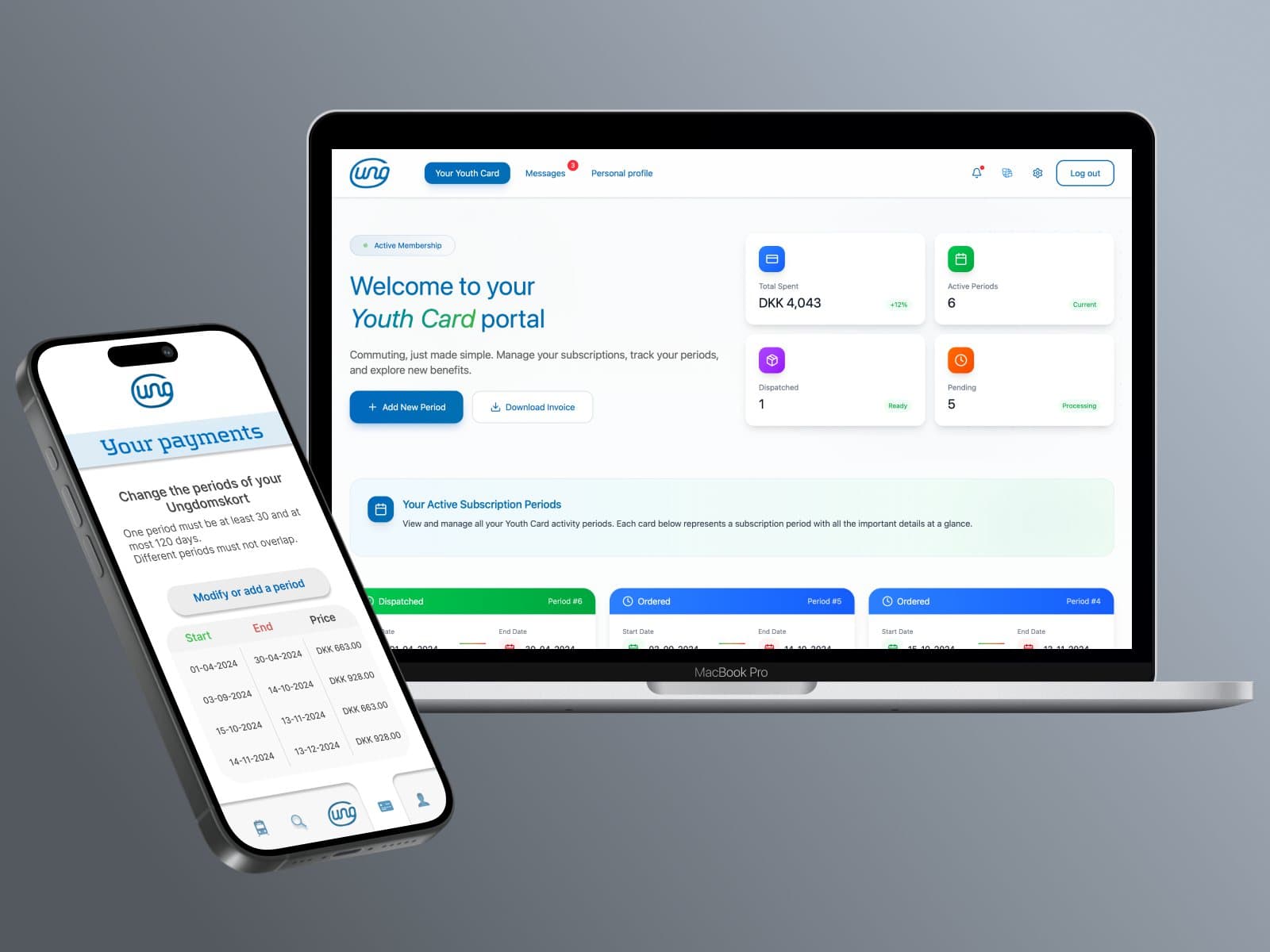
Ungdomskort: Transit Redesign
National Danish Student Travel Pass Overhaul. Website and mobile app redesign for Denmark’s national student transit service, solving payment complexity, mobile responsiveness, and enforcing strict WCAG 2.2 AA compliance.
X-Bit Museum App Design
Google UX Certificate Capstone Project. A comprehensive end-to-end UX/UI design process completed as part of the Google UX Design Certificate, featuring empirical user research, wireframing, high-fidelity prototyping, and usability testing.